So,
were you like me when you saw the December 22nd issue of the
Sports
Illustrated Sports Atlas? You couldn't wait to get to the
centerfold,
I'm sure.
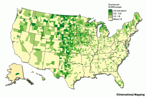
That huge map of the number of golf courses per capita by county was
just
scintillating.Or how about the map using graduated symbols that showed
the
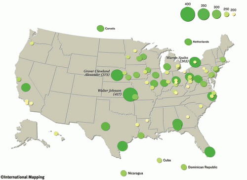
highest number of 200-win pitchers? It simply was a page-turner of
monumental
proportions, to say the least.(Click any image for a larger
view.)
OK, enough titillating innuendo.Quite frankly, the Sports Illustrated (SI) Sports Atlas that appeared on newsstands late in December was indeed shocking.I mean a sports magazine with 32 pages of maps?! I admit to being an avid fan of SI.I love sports, but the writing is superb.If you've never read a Rick Reilly editorial, you will find his back page column irreverent, funny, and extremely well written.
But on to maps and the atlas.The heavily map-laden issue appeared at the end of the 2004 when SI celebrated is 50th anniversary. Some very unusual thematic maps were on display thanks to International Mapping Associates (Ellicott City, Maryland) and DigitalGlobe (Longmont, Colorado) that supplied satellite imagery.
I
had the opportunity to interview both the author, B.J.Schechter, and
Alex Tait
of International Mapping Associates (IMA) to discover more about how
the
issue was conceived.So, how did this all come about? According to Mr.
Schechter, "We were trying to think of a different way to look at
sports on a
different scale.And we were searching for a way to look at the
country, and
try to put it in some perspective that readers would appreciate.And we
just
started brainstorming and coming up with all these different
categories.We
thought if we could find different ways to map it out and use different
types
of maps that it could be interesting to tell certain stories; we might
find
interesting facts or anomalies, and some things would be obvious to
some people
and not so obvious to others.It started off as maybe a smaller 10-12
page
package and ended up inventing itself into this 32-page epic."
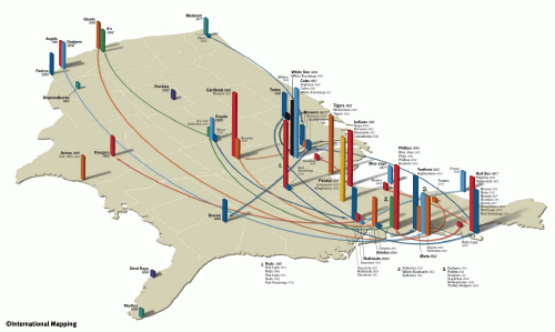
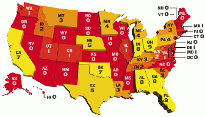
The challenge, of course, was not to throw a bunch of maps in an article and hope that it made sense.In fact, as you see by the illustrations on this page, there were some very unusual map styles.I asked Mr.Tait of IMA how it was decided that certain map styles were used and whether much trial and error was involved."We used two criteria for deciding which technique would be best. First we looked at the data and certain data types and geographic levels (county vs.state) tend to work better in certain map styles.The county maps, for example work well as choropleth maps so that you are able to see all the details.Done as 3D, it often obscures data.Second, we were aiming for visual impact and visual variety.Being SI, they wanted to be sure the graphics were arresting.So if we had done a bunch of 3D maps we then tried for some cartograms."
It
was definitely a risk for SI to attempt so many thematic maps
in
addition to
the variety of sports presented by theme.Mr.Schechter said, "That was
our
biggest concern.For someone who may not be interested in certain
sports, you
could go to their level of interest, but for true sports fans who
wanted to see
everything, they could look at the whole package from start to finish
and
remain engaged.Yet, for the average SI reader - mostly
men of
somewhat
questionable geographic literacy - lobbing multi-colored,
multi-variate,
three-dimensional perspective views their way could easily lead to an
SI
fumble." How did they get the idea that readers would take to this? Mr.
Schechter continued, "2004 was our fiftieth anniversary; we had a
project
called Fifty states in fifty weeks.And what we did is a profile of
every
single state, using a different state each week.We would have the best
athlete
that came from that state.And we featured the state's best known
sporting
event.We found that not only did the people in those states that we
profiled
really like that, but the people that lived in different states or grew
up in
different states were pretty competitive with one another.So, we said,
what
if we took the sports, and looked at it and at the country what would
we
find?" And so the issue was born.
But the challenge was to combine the data in such a way to make not only good looking maps, but ones that made sense.Mr.Tait said, "We always started with the data and often had two interesting variables or two variations of a single variable (density and number of or per capita and number of) that we wanted to show.They often get two different aspects of a phenomenon. For example, quarterbacks by state is shown in the cartograms as size equals per capita but it is also interesting to know number of so we colored them that way.For the bivariate choropleth maps (Golf and Olympic athletes) the desire was to get at economic factors helping explain golf course distribution in the one case and physical geographic factors helping explain athlete distribution in the other."
However,
would a variety of map styles become too confusing; too graphical? Some
of the
map styles fit well and were fun to look at; for example, the number of
golf
courses per capita.For others such as the number of athletes per city,
the map
style seemed a bit forced.So, I asked Mr.Tait if there were certain
data
types that SI wanted to use but did not exactly know the best
way to
represent
them or did they just run out of thematic styles to use and had to
choose
something.
"In the case you cite and in many of the others, we were limited by the type of data we had.Most of the athlete data is simply "place of birth." You can aggregate it to the county or state level and do some of the other mapping techniques, or you can do what we did in this case and geo-locate each athlete and have a proportional circle for that individual.We felt that was a good way to get at both the location and the magnitude of each players home run or win total.That said, there was a desire (both ours and SI's) to have visual variety and to use different mapping techniques.Maybe this one wasn't completely successful but I think you do see the trend of home run hitters from the southeast and of pitchers from the Midwest."
Satellite images were also used to highlight neighborhoods where there seemed to be an unusual concentration of well-known, highly accomplished athletes.But wouldn't a map make as much sense? "Well, really, we wanted an excuse to run some satellite images!" said Mr.Schechter."And we just thought that, here, this is a cool thing to do in the middle.We thought what if we were showing these maps of these large areas of the entire country, what if we just showed a map of a neighborhood, but what better way to do it than to show an image; an image from above rather than our own map.There is so much meat and potatoes on these other pages, this is kind of fun! Its unscientific.Were not saying that these three neighborhoods: Brooklyn, West Tampa, and Compton are the three best.Were just saying that these are three talent-rich neighborhoods."
IMA has a great deal of experience with mapping-making.Their clients include both domestic and international companies and organizations.In creating the maps for SI, the company used primarily ArcGIS to do the statistical mapping and for preparing the mapped data for manipulation.To convert the maps to more aesthetically appealing renderings, IMA used Adobe Illustrator and Adobe Photoshop.In addition, Bryce 5 was used for the three-dimensional extrusion renderings.
But
creating the maps was not the only obstacle.Data compilation was not
straightforward.Mr.Tait commented, "The biggest challenge was
collecting
and working with data sets.Very few data sets came through complete
and ready
to map.Some sports organization would provide SI with a data
set and
then the
real work began.We had to do a lot of research to fill holes in the
data sets
and to correctly geocode individual data items.For example we got a
list of U.S.
Olympic
athletes and their hometowns but some hometowns were missing or just
had a city
with no state or just a state with no city."
And what about the SI editors? Was this article a huge hurdle for the magazine editors normally enthralled with pin-up girls instead of push-pin maps? Mr. Schechter said, "Many of my colleagues asked me about it from time to time, but many of my fellow editors didn't see it until it was published.But one thing that we did was that, our managing editor, Terry McDonald, would be shown things, and the week we were closing this, we sat him down, and he actually took a fresh eye and read through it.So, that was helpful because by the time I was ready to close this thing, I was so familiar with all these maps, and many of the people working on this were as well, so it helped to have a fresh eye."
Hopefully
this issue was a success for SI as I would personally love to
see them
do this
again.Mr.Schechter said, "From people we've heard, and we get
anywhere from
seven to ten thousand letters each week...most people loved it; they
found it
very interesting.There's been a lot of people asking questions, or
pointing
out discrepancies or errors and nit-picking what if you did this this
person
was born here.In general, the response is, Wow, this is pretty cool."
Hmmm...Cool
maps vs.Swimsuits...???