On Friday, February 11th, I attended a
Web conference put on by MapInfo,
entitled "Predictive Analytics Solutions for Communications."
Christopher Cherry, Strategic Industry Manager for Communications, and Laura Sweet, Analytic Consultant, skillfully showed the functionality of AnySite (a MapInfo acquisition) and MapInfo Professional, for analyzing data and geographies particular to the communications industry.The workflows performed included ring and drivetime studies, as well as general analysis.
These workflows were designed for the average individual involved in this type of analysis in communication and other industries.The processes are well thought out and almost elegant in their ability to collect the results and portray them on a map or report.The reports (MapInfo Professional 7.5 includes Crystal Reports 8.5) were especially nice, and fully customizable with the company logo, etc.
However, I was surprised by two issues.
First, the session had "predictive analysis" in the title.I thought this would include some modeling, performance predictions, and perhaps sales estimates (for retail).I did see applications of lifestyle segmentation and some functionality for customer identification, but there were no models.Perhaps models are all customized using methodologies from the MapInfo/Thompson folks?
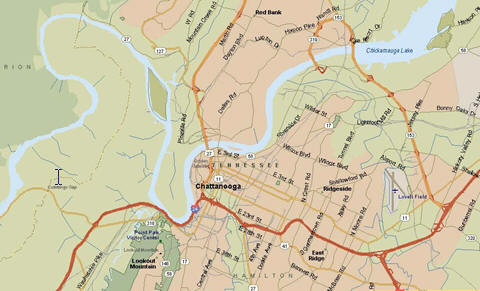
The second thing that really amazed me - and this is what I'll focus on in this article - was the quality of the maps.With the exception of gradients used in thematics, all the maps created had the same colors and symbology that were available in MapInfo 3.0.Back in the days of 3.0, sixteen colors were the norm.Just for fun, I took a screen shot of a map (below) from the presentation, put it into Paint Shop Pro and counted the colors.The grand total was 14 colors, and most of those were yellow derivatives.Most of these colors were a very ugly yellow.I am no cartographer and I make ugly maps too, but in business every map is part of selling an idea, or a location, etc., and "pretty always wins." The line work was not as fluid as one would expect, either.In the day of "pretty and free maps from Google" and from other mapping products that cost far less, I'm surprised this hasn't been a priority for MapInfo.
A map needs to be cartographically pleasing and interesting - those are the characteristics that drive people to maps in the first place.This example is not a fun or interesting map.
Two important characteristics that impact the map's presentation are a) the use and availability of color; and b) the quality of the line work. MapInfo Professional will display at least 65,000 colors and probably whatever your video card supports.Somehow, MapInfo has not brought what is possible to the end-users's toolbox.
Obviously, the software works well, the data and geography files are OK - the maps just need to look a lot better.
Check out the demo site for MapInfo Professional 7.5.(Note that version 7.8 is available for trial download, and there is a demo available.) Interestingly, the demo for version 7.5 steps through more product features.By the way, I did download version 7.8 to see if the maps looked better - nope, more of the same.
MapInfo Professional does not come (in the box) with a huge load of data - only 450MB.Most mapping products today come with loads of data. In fact, I have one product (software and data all for about $300) that comes with nine CDs of data.
Most vendors of geographic, street centerlines and other data create products in MapInfo format.So you would think MapInfo's samples would be better.One of the things you need to make maps look good is high quality geographic data.On my desk is a copy of Street Finder & Trip Maker from Rand McNally, for $39.95.The street files are from Tele Atlas, and the maps are very nice.How about MapPoint2004 with street files from both Tele Atlas and NAVTEQ? Check out this 90 color map from MapPoint 2004.
Perhaps additional colors could be more
fun, but check out how smooth the line work is...
I went to the ESRI Business Information Solutions (ESRI BIS) site and took a screen shot of this map (below).It uses transparent fill for a color relief image, and I would hope that MapInfo will do this too.The color count, according to Paint Shop Pro, is 50,831 colors.
In any graphic presentation, richer, deeper and more colorful is always better.I went back to the MapInfo presentation to see if I could find more examples and I found this MapInfo Professional image.This is a gradient thematic.
The total color count is 58,639.But this is gradient, which works just like a color ramp, so you would expect a lot of colors.My point is that MapInfo can display a lot of colors.
If MapInfo can create gradient, the potential must be there for the rest of the color spectrum in other maps too.Maybe it just needs to be exposed in the interface.Functionality is great; functionality that looks great is even better.I don't remember ever seeing a MapInfo map that was really stunning, except perhaps those maps that had been post-processed in 3rd party software.
We should expect more from our mapping software.In fact, we often get higher quality output in low cost consumer type mapping products than we do in professional packages.It shouldn't be a matter of the user finding the right setting, fiddling with colors or symbology.Maps should look good right out of the box.Most people who use MapInfo Professional are like me - not cartographers.If the map looks good, the user looks good.The fact that the product has the potential to make pretty maps, doesn't mean the user will.The look that was cool in MapInfo 3.0 should not be acceptable in version 7.8 ten years later.
Christopher Cherry, Strategic Industry Manager for Communications, and Laura Sweet, Analytic Consultant, skillfully showed the functionality of AnySite (a MapInfo acquisition) and MapInfo Professional, for analyzing data and geographies particular to the communications industry.The workflows performed included ring and drivetime studies, as well as general analysis.
These workflows were designed for the average individual involved in this type of analysis in communication and other industries.The processes are well thought out and almost elegant in their ability to collect the results and portray them on a map or report.The reports (MapInfo Professional 7.5 includes Crystal Reports 8.5) were especially nice, and fully customizable with the company logo, etc.
However, I was surprised by two issues.
First, the session had "predictive analysis" in the title.I thought this would include some modeling, performance predictions, and perhaps sales estimates (for retail).I did see applications of lifestyle segmentation and some functionality for customer identification, but there were no models.Perhaps models are all customized using methodologies from the MapInfo/Thompson folks?
The second thing that really amazed me - and this is what I'll focus on in this article - was the quality of the maps.With the exception of gradients used in thematics, all the maps created had the same colors and symbology that were available in MapInfo 3.0.Back in the days of 3.0, sixteen colors were the norm.Just for fun, I took a screen shot of a map (below) from the presentation, put it into Paint Shop Pro and counted the colors.The grand total was 14 colors, and most of those were yellow derivatives.Most of these colors were a very ugly yellow.I am no cartographer and I make ugly maps too, but in business every map is part of selling an idea, or a location, etc., and "pretty always wins." The line work was not as fluid as one would expect, either.In the day of "pretty and free maps from Google" and from other mapping products that cost far less, I'm surprised this hasn't been a priority for MapInfo.
 |
| MapInfo
U.S.Map presentation.Source: MapInfo.Click image for larger view. |
A map needs to be cartographically pleasing and interesting - those are the characteristics that drive people to maps in the first place.This example is not a fun or interesting map.
Two important characteristics that impact the map's presentation are a) the use and availability of color; and b) the quality of the line work. MapInfo Professional will display at least 65,000 colors and probably whatever your video card supports.Somehow, MapInfo has not brought what is possible to the end-users's toolbox.
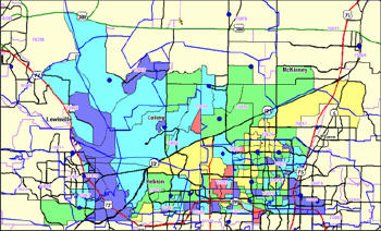 |
| In
this thematic example from the presentation, the color count is a
rousing 26.
Source: MapInfo. |
Obviously, the software works well, the data and geography files are OK - the maps just need to look a lot better.
Check out the demo site for MapInfo Professional 7.5.(Note that version 7.8 is available for trial download, and there is a demo available.) Interestingly, the demo for version 7.5 steps through more product features.By the way, I did download version 7.8 to see if the maps looked better - nope, more of the same.
MapInfo Professional does not come (in the box) with a huge load of data - only 450MB.Most mapping products today come with loads of data. In fact, I have one product (software and data all for about $300) that comes with nine CDs of data.
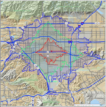
Most vendors of geographic, street centerlines and other data create products in MapInfo format.So you would think MapInfo's samples would be better.One of the things you need to make maps look good is high quality geographic data.On my desk is a copy of Street Finder & Trip Maker from Rand McNally, for $39.95.The street files are from Tele Atlas, and the maps are very nice.How about MapPoint2004 with street files from both Tele Atlas and NAVTEQ? Check out this 90 color map from MapPoint 2004.
 |
| Map generated using MapPoint 2004. Click image for larger
view. |
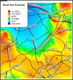
I went to the ESRI Business Information Solutions (ESRI BIS) site and took a screen shot of this map (below).It uses transparent fill for a color relief image, and I would hope that MapInfo will do this too.The color count, according to Paint Shop Pro, is 50,831 colors.
 |
| Map generated using MapPoint 2004.Source: ESRI BIS Website. |
In any graphic presentation, richer, deeper and more colorful is always better.I went back to the MapInfo presentation to see if I could find more examples and I found this MapInfo Professional image.This is a gradient thematic.
 |
| Gradient thematic map.Source: MapInfo Website. |
The total color count is 58,639.But this is gradient, which works just like a color ramp, so you would expect a lot of colors.My point is that MapInfo can display a lot of colors.
If MapInfo can create gradient, the potential must be there for the rest of the color spectrum in other maps too.Maybe it just needs to be exposed in the interface.Functionality is great; functionality that looks great is even better.I don't remember ever seeing a MapInfo map that was really stunning, except perhaps those maps that had been post-processed in 3rd party software.
We should expect more from our mapping software.In fact, we often get higher quality output in low cost consumer type mapping products than we do in professional packages.It shouldn't be a matter of the user finding the right setting, fiddling with colors or symbology.Maps should look good right out of the box.Most people who use MapInfo Professional are like me - not cartographers.If the map looks good, the user looks good.The fact that the product has the potential to make pretty maps, doesn't mean the user will.The look that was cool in MapInfo 3.0 should not be acceptable in version 7.8 ten years later.
From Our Homepage
Saying Farewell to an Amazing Journey
Communicating with Maps
Is There a GIS Career Ladder?
What does it mean to be geospatially smart? Series
Ways Real Estate and Property Developers Utilize Melissa GeoData for Data-Driven Decisions
Unlocking Value From Daily Satellite Imagery and Insights
Maximizing the Value of Your Address Data with Geo Addressing
How Indoor Mapping Enhances the Security of Smart Buildings
Look Ahead: AI, Location Intelligence and Efficiency
Collaboration Takes on Sea Level Rise & Dynamic Technology Environments
Brownies for Brownfields
Has Everything Been Mapped Already?
How Is Data Literacy Changing in an Artificial Intelligence Landscape
Portfolios for GIS Professionals: More Than Just Maps
How to Create a Distance Matrix in QGIS - A Step-by-Step Guide
7 Ideas for Bringing GIS into the K-12 Classroom
The Geography of Movement