We get it. Geospatial visualization is here and it isn't going away. After all, if it doesn't show up on Google Earth or Bing Maps, then we reserve the right to question its existence in the real world. Furthermore, now every opportunistic IT vendor is asking their customers "would you like a map with that?" Geospatial context has deservedly moved from the geek-gated backroom to the boardroom, and now it's an expected standard, not a luxury option. There's a growing sense of entitlement to spatial data from the C suite to the feet-on-the-street. They all want to be able to see it on a map; sales data, demographic data, competitor data, production data, inventory, supply chain, weather hazards, security hazards...the ‘where" aspect of data has taken its rightful spot beside the "who", "how much" and "when".
That said, we've still got some distance to cover to arrive at a technology platform which puts the controls in the hands of the business user or information worker as opposed to those privileged few at the top of the data "caste" system. There is still a race to see who can create the toolset which allows the tech-light business user to access, manipulate geospatial data and augment it with other relevant enterprise information.
GIS gets put in its place... Spatial ain't that special anymore
Once a hallowed occupant of black boxes marked with labels such as "ESRI" or "Intergraph,"and accessible by a select "spatially literate" few, spatial data has breached the threshold and rapidly become ‘just another type of data". Now that SQL Server and Oracle boast spatial extents, spatial data can be stored alongside other less revered types of data and incorporated into data visualizations and reporting. Furthermore, with the commoditization of Web-based maps, thanks to Bing and Google Maps, there are enough maps to go around. We just need a little help building out the information story on top of that map. Filtering sales performance by region or determining proximity of assets to a hazardous chemical spill are functionality now expected by the information worker, without ‘needing to call IT". If a consumer can pull up an iPhone app and locate the nearest Starbucks, hospital and H1N1 infections, then companies and organizations expect their more complex information to be similarly available in an array of spatial "flavors."
Don't bring a map to a gun fight
There you are. What now? Knowing what facility, territory or country an event occurs in is undeniably a useful information element, but alone is insufficient in solving a complex issues such as a marketing effectiveness issue or countering an uptick in gang related shootings in an inner city. Moreover, there are other useful data paradigms that accompany spatial data in providing a holistic understanding of a complex phenomenon. To take the gang-crime example further, alongside where a gang crime occurs, mining through the relational affiliations of the perpetrator, previous convictions , MO of the crime, vehicles involved, when it occurred, motives (financial or otherwise), forensics, ballistics, available camera imagery , similarity to other verbal/written crime reports...there's an endless list of opportunities to ‘join the dots' based on commonalities beyond geographic proximity. Therefore, to understand and effectively address a crime trend, law enforcement would have to employ a host of other technologies to provide the most comprehensive picture; search technology, data mining, business intelligence, unified communications technology, biometric technology, sensor infrastructure, data visualization portals, etc. Precursors of this necessary shift are evident in the IT industry, for example the market research firm IDC, has already squeezed spatial technologies into the broader business analytics market (Worldwide Business Analytics Software 2009-2013 Forecast)
Under Where? The fortuitous failure of the Underpants Bomber
The ‘where' in this case was the presumably voluminous underpants pouch of one Umar Farouk Abdulmutallab, who tried to explode them aboard a Detroit-bound flight on Christmas Day 2009. The incident was viewed as an intelligence failure, as the CIA couldn't piece together the clues to flag him as a hazard. Thanks to a few quick thinking passengers and staff, a disaster was averted (thankfully though many societal taboos are long gone, rummaging around in your drawers while in a public place still will draw attention to yourself). That said, after the event was labeled an ‘intelligence failure' and the CIA received a verbal lashing from the Commander in Chief himself. We "Monday morning quarterbacks" get the benefit of hindsight to dissect the now obvious ‘clues' that were hidden in plain sight.
And there were a few ‘tells' (in the Poker sense):
- Umar had no luggage
- NSA, through a nifty piece of eavesdropping, had a piece of intel that there could be a possible attack originating in Yemen
- He was not in possession of a valid passport
- Abdulmutallab's father had warned the U.S. Embassy in Abuja, Nigeria, that his son had disappeared and may have fallen in with Islamic "extremists" in Yemen
- A communications intercept of Qaeda followers in Yemen reported a man named "Umar Farouk" had volunteered for a coming operation
- Other US intelligence reported a possible unspecified attack against a Western target during the holiday period.
These various snippets of intelligence were likely "available" to intelligence analysts, but in its defense the CIA pointed out the sheer volume of information available, and the difficulty of assembling a ‘lead' from latent, partial snippets of relevant data in an ocean of irrelevant material. An analogy would be putting your hand in the dark bag of scrabble letters and hoping to spell out a 13 letter word without taking your hand out of the bag.
Indeed it is impressive that all of these intelligence scraps were collected by the CIA and the NCTC and in their possession, but where the process broke down was in surfacing pertinent but latent ‘clues' to an analyst in a manner which was contextual, visible, and available for analysis. This is where data visualization, combined with automated search and analytics, can be better exploited.
Assume the existence of a "terrorist timeline," a possible linear set of events that lead up to a terrorist act. Here is an admittedly simplified form of that timeline:
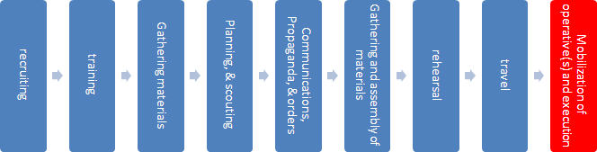 |
Each activity would generate ‘tells' or clues that can be captured as data points, a ‘digital DNA' in the forensics sense. For example, communication of an order through the chain is intercepted or a TSA agent recognizes a rehearsal of a terrorist act in the planning stage. Theoretically, if an association can be made between two of more of those points, based on that actionable intelligence, a terrorist event could be prevented. So let's apply that to our example of the underwear bomber, and model how visualization could assist in helping link those data points together:
First, a "geofence" is drawn on an electronic map that flags all travelers coming from Yemen (based on intercepted communications that identified Yemen as a likely origin of the holiday attack). Technologies such as "Visual Fusion" can facilitate intelligence analysts having these type of mash-up and visual query capabilities.
 |
Any traveler with a journey leg originating or travelling through Yemen becomes a ‘hot' red point on the map. This large number of points on the map could be filtered based on individuals intelligence based ‘risk' profile...are they on any federal watch lists, do they have a criminal profile? Does their name occur in any intercepted "intel" or previous incidents? The ‘tolerance' or threshold of this filtering could be modified using visual slider tools which help reduce the number of ‘hot dots' to a manageable amount. Further visualization would display relational links to any individuals or groups associated with terrorist activities, again being filtered by ‘degrees of separation', where reducing from three to two degrees of separation would reduce the persons of interest further. In the case of Abdulmutallab, the father's warning to the intelligence community would have displayed Abdulmutallab as being one or two degrees of separation between him and exetremist groups in Yemen.
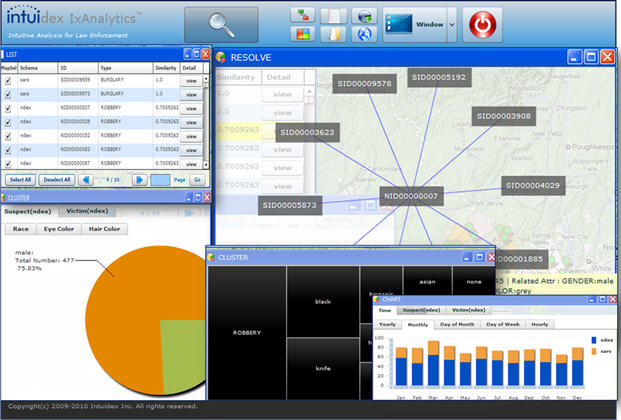 |
Back-end search engines and advanced analytics software (for example I2 or Intuidex technologies for entity extraction and analytics) could propose possible MOs, looking for tenuous correlations between intercepted ‘chatter' and similarities with the profile of all travelers on the past few days. In this case the name "Farouk" and the father's warning may have surfaced. Risk profiles could be relayed visually as histograms or ‘spark-lines'.
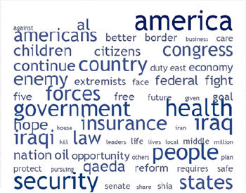 |
These would appear as a ‘tag cloud' visualization, color coded to connect them with higher ranked intelligence snippets relating to possible terrorist MO. Of course the ideal would be for an analyst or analysts to be able to visually investigate the information in these multiple modalities and metaphors in the interest of uncovering a pattern or anomaly, or best of all joining two or more key pieces of intelligence. Other alerts or intelligence based on ‘eyes on the street' intelligence such as the check-in attendant who noticed passport irregularities or the lack of realistic luggage should have increased the ‘severity' or risk index visualization of this particular passenger, and by the time we apply all these visual filters, Abdulmutallab should have been lighting up the visualization like a screaming Roman candle. That's easy for me to say from the comfort of my Quarterback's armchair, but I have to believe that better ‘surfacing' of these intelligence snippets in multi-modal visualization tools could be better exploited in the dot-connecting process
You can't get there from here... with just a map
I think we are still a long way from analytics and visualization software catching criminals on their own. However I do believe that analytics and visualization software can be more ‘assistive' in surfacing information from the data glut, screaming for further investigation by wetware (humans).The fascination with maps in solving complex, real world puzzles is understandable. However, geospatial visualization alone is an incomplete picture unless it is able to launch other visualization elements which manipulate and dissect information based on an endless array of other visual contexts as well. In the case of catching the bad guy with exploding undergarments; contexts other than space would be time, severity, risk, relevant keywords, category, relationships, etc. This is the only way to tell the most comprehensive story in a visual medium, in the hope of identifying a latent, but critical connection between the data points contained therein.
Sometimes when you're joining the dots, those dots fall off the map.
Source: NEWSWEEK: February 02, 2010 4:14 PM A Single Database Held All the Spies' 'Bits and Pieces' on Alleged Underpants Bomber Mark Hosenball