Maps published in print or on the Web
must communicate visually, and the more visually rich their symbology,
color and graphic technique, the more successfully they will
communicate.
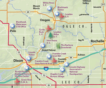 Adobe
Illustrator's graphic capabilities provide you many ways of enhancing
the visual quality of your GIS data, as shown in Figure 1, at left.
Adobe
Illustrator's graphic capabilities provide you many ways of enhancing
the visual quality of your GIS data, as shown in Figure 1, at left.
Software programs like Adobe Illustrator and Photoshop have evolved into sophisticated communication tools, inviting cartographers to add visual value to their maps using transparency, drop shadows, complex graphic styles, and layered symbols, among other effects.
The visual quality of your maps, if not various aspects of your workflow, may improve if you take your map from your GIS to the desktop.In this first of several articles, we'll explore the value of making that journey and review some travel tips to get you there.
Leaving Home
Starting a map in a GIS program and then switching to a desktop program is a bother.Time, workflow management, and other factors could add up to greater time and cost.But the benefits to going to the desktop can outweigh the costs -- and those benefits may include workflow efficiency or just simply producing a more visually valuable map as a result.
Trip Planning
When planning your trip to the desktop, consider your "packing" philosophy -- do you want to travel light or pack a lot of gear so you have maximum flexibility at your fingertips? From your GIS, you can take your map into Adobe Illustrator following either of two routes:
 Getting There is Half the Fun
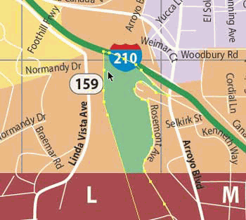
Traveling either route, your data arrives in Illustrator as vector points, lines or polygons.This means your data is "live," that is, graphically editable, allowing you to select and edit constituent points, shapes, color or symbology as often as you like until the moment you complete the map and ship the file to a printer.Figure 2, at right, shows that vector objects remain selectable and editable throughout the production process.
To get your GIS-exported Illustrator or PDF file into Illustrator, simply start Illustrator and choose File > Open.Your map opens as a vector drawing.
To get your coverage files into Illustrator, use the MAPublisher suite of GIS filters from Avenza Systems, Inc. that can be installed as filters within Illustrator.With MAPublisher's File > Import Map Data, you simply locate your coverage files and import them.The data of each file is imported and placed on a unique layer.(MAPublisher will split a coverage file into separate layers for points, lines or polygons if your file contained a mix of feature types.)
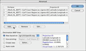
Figure 3.MAPublisher's Import Map Data dialog.
Organizational Skills
Illustrator visually displays and prints using a hierarchical structure.What's at the top of a stacking order displays or prints on top of what's below.You'll want to organize your data, preferably splitting it up into lots of layers, for two practical purposes.One purpose is to visually organize the geographic structure of the map. For example, you'll want the hydrography layers to underlay the transportation layers.The second purpose is to help you later when you need to select all of a class of geographic features.By splitting your transportation features into separate layers for interstates, federal highways, state highways, and so forth, you can globally select interstates by targeting and selecting the interstates layer.
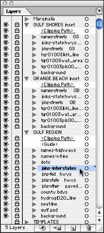
Figure 4, at left, shows how Illustrator's Layers palette lets you divide data into a hierarchical structure; it also enables you to view, hide and lock groups of layers for improved efficiency while you work.
If you colored your features in your GIS prior to exporting an Illustrator or PDF file, then you can use Illustrator Select commands to select features by their graphic color or line weight or other graphic parameter.If you imported coverage files, then you can use MAPublisher's Select by Attribute filter to select data by feature code attributes.
The Layers palette allows you to group layers in families.You can create a master Roads layer and have your data organized on sublayers (one sublayer for interstates, another for federal highways, and so forth).While working on hydrography, for example, you can hide the Roads master layer and with it all the road linework, helping you concentrate on the hydrography as you edit its data.
A special breed of layer is called a "template." This is a non-printing layer that can be used as a visual reference or to store data that you're not entirely comfortable with discarding until the map is closer to completion.
The end result is that you've organized the map hierarchically in layers, and given yourself the flexibility of working with geographic features on individual layers.
Symbolizing Things
Now that your map is organized, you're ready to benefit from Illustrator's powerhouse of graphic symbology and visual effects.
Your principal tools are Illustrator's palettes.With palettes, like the Color and Stroke palettes, you directly "paint" your lines and polygons.With others, like the Styles and Symbols palettes, you create master styles or graphic symbols that permit you to make changes to the master that Illustrator then automatically conveys to all data painted with those styles or symbols.The Appearance palette is a powerful laboratory for creating complex symbols and visual effects.
Let's look at some easy symbolization techniques you can perform.(In a future article, we'll delve in detail into the steps you would take to achieve these techniques.)
Color Swatches
Create a color library for your map using the Eyedropper tool to sample colors from photographs, scans, other maps, or from a terrain image. Each color swatch can be fine-tuned to precise CMYK or Pantone values for printing or to RGB values for Web images.A swatch can be made "global" so that later adjustments to the color composition of the swatch will be reflected automatically in all features originally painted with that swatch.
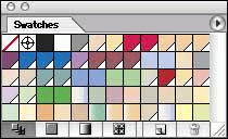
The swatches palette (shown at left in Figure 6) serves as a document-wide color, gradient and pattern library.The swatches of other documents can also be accessed, lending a uniformity of color among similar maps.)
Multi-line Line Symbols
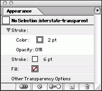
Create a multi-line interstate symbol by constructing the symbol hierarchically in the Appearance palette.Create a thick green line ("stroke"), overlay it with a thinner white stroke and overlay that with a thinner green line.Then turn this symbol into a Graphic Style so that when you select all data on your interstates layer, you can paint all lines with this symbol with a single mouse click in the Styles palette.Or, get more creative and construct an interstate style that's transparent in the middle instead of white, letting other symbology or even a background terrain image appear between the parallel lines of the interstates.
Stroked Type
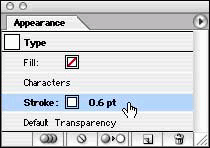
Sometimes type cannot visually compete against a background of other symbology or a terrain image.A classic technique that you can quickly replicate is adding a white border around the letter characters.The Appearance palette lets you add a white stroke below the characters (so that the white outline doesn't cut into, and thus deform, the letter characters).Again, you can turn this into a Style and apply it to all selected type with a single mouse click.
Double-bordered Polygons
Select a park, administrative area or other polygon.In the Appearance palette, give the polygon line a thick dark stroke.Then add a second lighter, thinner stroke and apply the Illustrator's Offset Path effect to wrap the second stroke as an parallel line inside the first line.If you need to adjust the shape of this polygon, both boundary lines flow perfectly in sync following your edit to the polygon.
Vignettes
Select a large water polygon and give it a light vignette that follows the shoreline using the Inner Glow effect.If you need to edit the shape of the shoreline, the vignette adjusts automatically.Also, you can recolor the vignette by selecting the polygon and editing the parameters of the Inner Glow effect.
Gradients
To focus attention on a feature, create a radial gradient underneath it, or use a linear gradient to as a tab leader connecting an inset to its location on the main map.Gradients are "live," meaning that changes to the shape of the object that holds the gradient results in an automatic update of the gradient within the object.Edits to the gradient's colors are also automatically reflected in the object.
Gradient Mesh
Does your map have large areas of plain color, like a large park or administrative area? Break the monotony by turning a polygon into an Illustrator gradient mesh.The mesh allows you to select mesh points and assign them different colors or tints.The result is a polygon that appears airbrushed with undulating colors.
Drop Shadows
Visually heighten the prominence of point symbols (including highway shields) with high-resolution drop shadows that cast soft shadows on symbology below them.The symbol shapes and their drop shadows remain "live," allowing you to change color, shape, shadow opacity as you develop the map and see the interplay between symbols and other map features.
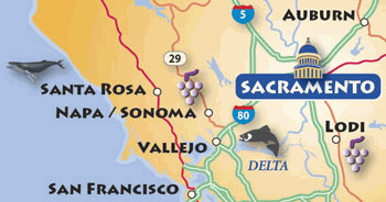
Figure 13 shows how drop shadows can fall on other symbols, type and background images.
Illustrator Symbols
If you use graphic symbols to represent your point data, Illustrator offers you a flexible way to maintain and change symbol designs.For a recreation map, for example, create or add a master symbol to Illustrator's Symbols palette.Drag and drop symbols from the palette at the locations of your point data. Later, you may decide that the size, color, shape or overall design of the symbol can be improved.You edit the master symbol and all "instances" of the master symbol are changed automatically across the map.
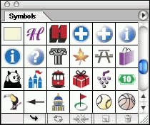
Figure 14, to the left, shows Illustrator's Symbols palette, a library of symbols that can also be accessed from other documents.
3D Symbols
Turn a mundane flat map symbol like a camping tent or picnic table into an eye-catching 3D symbol.Using Illustrator's 3D Effect, you can revolve, bevel and extrude any graphic shape.Like all of Illustrator's Effects, the 3D effect is "live." You can edit it later, adjusting its 3D properties.Creating a Graphic Style from it, you can easily turn other flat symbols into 3D symbols with a single mouse click-all will share the same rotation, extrusion and bevel properties.
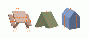
Figure 15, at right, shows Illustrator's 3D Effect applied to three symbols.The red centerlines highlight the original shapes you draw that serve as input for the 3D Effect.
Transparency
Select your polygons for various classes of federal lands, assign each class a distinctive fill color, and then adjust their transparency level and blending mode so that they colorize a terrain image sitting in the background.This is a quick way to make a design mock-up without having to tediously transfer vector artwork from Illustrator to Photoshop to accomplish the same effect.
Masking
Some of your polygons may never see the light of day as symbolized vector objects.Instead, you may choose to import them into Photoshop from Illustrator so that you can use them to select and mask areas of a raster image, such as a terrain image.(Illustrator lets you register a raster image from Photoshop so that Illustrator artwork can be brought into Photoshop exactly in position relative to the raster image.) In Photoshop, you use masks to screen areas, colorize area features, or create special visual effects like drop shadows and vignettes.
Take a Free Trip!
Desktop software makes this kind of flexibility easy and efficient to achieve.Download a tryout version of Adobe Illustrator.You can also download a demo version of the Avenza MAPublisher filters.
You can read excerpts from the Adobe Illustrator CS Wow! Book (Peachpit Press) that relate to cartography and type treatments using Illustrator's tools and techniques.
What the Future Holds
Our next article will focus on importing your GIS map or coverage files into Illustrator and how you would work with the data in Illustrator to edit your data and organize your map graphically and geographically.
Adobe
Illustrator's graphic capabilities provide you many ways of enhancing
the visual quality of your GIS data, as shown in Figure 1, at left.Software programs like Adobe Illustrator and Photoshop have evolved into sophisticated communication tools, inviting cartographers to add visual value to their maps using transparency, drop shadows, complex graphic styles, and layered symbols, among other effects.
The visual quality of your maps, if not various aspects of your workflow, may improve if you take your map from your GIS to the desktop.In this first of several articles, we'll explore the value of making that journey and review some travel tips to get you there.
Leaving Home
Starting a map in a GIS program and then switching to a desktop program is a bother.Time, workflow management, and other factors could add up to greater time and cost.But the benefits to going to the desktop can outweigh the costs -- and those benefits may include workflow efficiency or just simply producing a more visually valuable map as a result.
Trip Planning
When planning your trip to the desktop, consider your "packing" philosophy -- do you want to travel light or pack a lot of gear so you have maximum flexibility at your fingertips? From your GIS, you can take your map into Adobe Illustrator following either of two routes:
- Export your compiled, color-coded map as an Illustrator or editable PDF file (only graphic objects with no GIS attribute data will be available to you in Illustrator), or
- Save coverages as GIS-format files, such as ArcView Shapes
(GIS attribute data will be available when the files are imported into
Illustrator).
Getting There is Half the FunTraveling either route, your data arrives in Illustrator as vector points, lines or polygons.This means your data is "live," that is, graphically editable, allowing you to select and edit constituent points, shapes, color or symbology as often as you like until the moment you complete the map and ship the file to a printer.Figure 2, at right, shows that vector objects remain selectable and editable throughout the production process.
To get your GIS-exported Illustrator or PDF file into Illustrator, simply start Illustrator and choose File > Open.Your map opens as a vector drawing.
To get your coverage files into Illustrator, use the MAPublisher suite of GIS filters from Avenza Systems, Inc. that can be installed as filters within Illustrator.With MAPublisher's File > Import Map Data, you simply locate your coverage files and import them.The data of each file is imported and placed on a unique layer.(MAPublisher will split a coverage file into separate layers for points, lines or polygons if your file contained a mix of feature types.)
Figure 3.MAPublisher's Import Map Data dialog.
Organizational Skills
Illustrator visually displays and prints using a hierarchical structure.What's at the top of a stacking order displays or prints on top of what's below.You'll want to organize your data, preferably splitting it up into lots of layers, for two practical purposes.One purpose is to visually organize the geographic structure of the map. For example, you'll want the hydrography layers to underlay the transportation layers.The second purpose is to help you later when you need to select all of a class of geographic features.By splitting your transportation features into separate layers for interstates, federal highways, state highways, and so forth, you can globally select interstates by targeting and selecting the interstates layer.
Figure 4, at left, shows how Illustrator's Layers palette lets you divide data into a hierarchical structure; it also enables you to view, hide and lock groups of layers for improved efficiency while you work.
If you colored your features in your GIS prior to exporting an Illustrator or PDF file, then you can use Illustrator Select commands to select features by their graphic color or line weight or other graphic parameter.If you imported coverage files, then you can use MAPublisher's Select by Attribute filter to select data by feature code attributes.
The Layers palette allows you to group layers in families.You can create a master Roads layer and have your data organized on sublayers (one sublayer for interstates, another for federal highways, and so forth).While working on hydrography, for example, you can hide the Roads master layer and with it all the road linework, helping you concentrate on the hydrography as you edit its data.
A special breed of layer is called a "template." This is a non-printing layer that can be used as a visual reference or to store data that you're not entirely comfortable with discarding until the map is closer to completion.
The end result is that you've organized the map hierarchically in layers, and given yourself the flexibility of working with geographic features on individual layers.
Symbolizing Things
Now that your map is organized, you're ready to benefit from Illustrator's powerhouse of graphic symbology and visual effects.
Your principal tools are Illustrator's palettes.With palettes, like the Color and Stroke palettes, you directly "paint" your lines and polygons.With others, like the Styles and Symbols palettes, you create master styles or graphic symbols that permit you to make changes to the master that Illustrator then automatically conveys to all data painted with those styles or symbols.The Appearance palette is a powerful laboratory for creating complex symbols and visual effects.
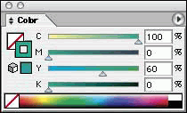 Figure 5a |
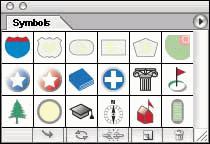 Figure 5d |
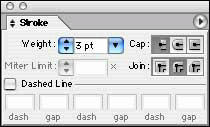 Figure 5b |
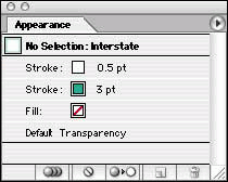 Figure 5e |
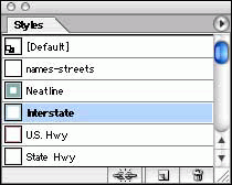 Figure 5c |
Figures 5a, 5b, 5c, 5d, 5e (above and to the left), show Illustrator's principal palettes for editing the graphics of your data. |
Let's look at some easy symbolization techniques you can perform.(In a future article, we'll delve in detail into the steps you would take to achieve these techniques.)
Color Swatches
Create a color library for your map using the Eyedropper tool to sample colors from photographs, scans, other maps, or from a terrain image. Each color swatch can be fine-tuned to precise CMYK or Pantone values for printing or to RGB values for Web images.A swatch can be made "global" so that later adjustments to the color composition of the swatch will be reflected automatically in all features originally painted with that swatch.
The swatches palette (shown at left in Figure 6) serves as a document-wide color, gradient and pattern library.The swatches of other documents can also be accessed, lending a uniformity of color among similar maps.)
Multi-line Line Symbols
Create a multi-line interstate symbol by constructing the symbol hierarchically in the Appearance palette.Create a thick green line ("stroke"), overlay it with a thinner white stroke and overlay that with a thinner green line.Then turn this symbol into a Graphic Style so that when you select all data on your interstates layer, you can paint all lines with this symbol with a single mouse click in the Styles palette.Or, get more creative and construct an interstate style that's transparent in the middle instead of white, letting other symbology or even a background terrain image appear between the parallel lines of the interstates.
 |
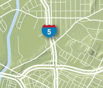 |
Figure 7a shows the Appearance pallette for
creating an interstate symbol with a transparent middle, and Figure 7b
shows the resulting interstate symbol.For a more conventional
interstate symbol, see the Appearance palette in Figure 5e.
Stroked Type
Sometimes type cannot visually compete against a background of other symbology or a terrain image.A classic technique that you can quickly replicate is adding a white border around the letter characters.The Appearance palette lets you add a white stroke below the characters (so that the white outline doesn't cut into, and thus deform, the letter characters).Again, you can turn this into a Style and apply it to all selected type with a single mouse click.
 |
 |
Figure 8a shows the Appearance palette that
contructs a white-stroked type, and Figure 8b shows the resulting type.
Double-bordered Polygons
Select a park, administrative area or other polygon.In the Appearance palette, give the polygon line a thick dark stroke.Then add a second lighter, thinner stroke and apply the Illustrator's Offset Path effect to wrap the second stroke as an parallel line inside the first line.If you need to adjust the shape of this polygon, both boundary lines flow perfectly in sync following your edit to the polygon.
 |
 |
Figures 9a and 9b
shows using the Offset Path effect to create a double-bordered polygon.
Vignettes
Select a large water polygon and give it a light vignette that follows the shoreline using the Inner Glow effect.If you need to edit the shape of the shoreline, the vignette adjusts automatically.Also, you can recolor the vignette by selecting the polygon and editing the parameters of the Inner Glow effect.
Figure 10 shows the
result of using the Inner Glow effect to create a shoreline vignette.
Gradients
To focus attention on a feature, create a radial gradient underneath it, or use a linear gradient to as a tab leader connecting an inset to its location on the main map.Gradients are "live," meaning that changes to the shape of the object that holds the gradient results in an automatic update of the gradient within the object.Edits to the gradient's colors are also automatically reflected in the object.
Figure 11 shows an example of a radial
gradient and a linear gradient.
Gradient Mesh
Does your map have large areas of plain color, like a large park or administrative area? Break the monotony by turning a polygon into an Illustrator gradient mesh.The mesh allows you to select mesh points and assign them different colors or tints.The result is a polygon that appears airbrushed with undulating colors.
Figure 12 shows
filling a polygon with a gradient mesh.
Drop Shadows
Visually heighten the prominence of point symbols (including highway shields) with high-resolution drop shadows that cast soft shadows on symbology below them.The symbol shapes and their drop shadows remain "live," allowing you to change color, shape, shadow opacity as you develop the map and see the interplay between symbols and other map features.
Figure 13 shows how drop shadows can fall on other symbols, type and background images.
Illustrator Symbols
If you use graphic symbols to represent your point data, Illustrator offers you a flexible way to maintain and change symbol designs.For a recreation map, for example, create or add a master symbol to Illustrator's Symbols palette.Drag and drop symbols from the palette at the locations of your point data. Later, you may decide that the size, color, shape or overall design of the symbol can be improved.You edit the master symbol and all "instances" of the master symbol are changed automatically across the map.
Figure 14, to the left, shows Illustrator's Symbols palette, a library of symbols that can also be accessed from other documents.
3D Symbols
Turn a mundane flat map symbol like a camping tent or picnic table into an eye-catching 3D symbol.Using Illustrator's 3D Effect, you can revolve, bevel and extrude any graphic shape.Like all of Illustrator's Effects, the 3D effect is "live." You can edit it later, adjusting its 3D properties.Creating a Graphic Style from it, you can easily turn other flat symbols into 3D symbols with a single mouse click-all will share the same rotation, extrusion and bevel properties.
Figure 15, at right, shows Illustrator's 3D Effect applied to three symbols.The red centerlines highlight the original shapes you draw that serve as input for the 3D Effect.
Transparency
Select your polygons for various classes of federal lands, assign each class a distinctive fill color, and then adjust their transparency level and blending mode so that they colorize a terrain image sitting in the background.This is a quick way to make a design mock-up without having to tediously transfer vector artwork from Illustrator to Photoshop to accomplish the same effect.
Figure 16 shows a
background terrain image colorized by the polygon for a city boundary
that has been filled with color and given transparency and blending
mode parameters.
Masking
Some of your polygons may never see the light of day as symbolized vector objects.Instead, you may choose to import them into Photoshop from Illustrator so that you can use them to select and mask areas of a raster image, such as a terrain image.(Illustrator lets you register a raster image from Photoshop so that Illustrator artwork can be brought into Photoshop exactly in position relative to the raster image.) In Photoshop, you use masks to screen areas, colorize area features, or create special visual effects like drop shadows and vignettes.
Take a Free Trip!
Desktop software makes this kind of flexibility easy and efficient to achieve.Download a tryout version of Adobe Illustrator.You can also download a demo version of the Avenza MAPublisher filters.
You can read excerpts from the Adobe Illustrator CS Wow! Book (Peachpit Press) that relate to cartography and type treatments using Illustrator's tools and techniques.
What the Future Holds
Our next article will focus on importing your GIS map or coverage files into Illustrator and how you would work with the data in Illustrator to edit your data and organize your map graphically and geographically.
From Our Homepage
Saying Farewell to an Amazing Journey
Communicating with Maps
Is There a GIS Career Ladder?
What does it mean to be geospatially smart? Series
Ways Real Estate and Property Developers Utilize Melissa GeoData for Data-Driven Decisions
Unlocking Value From Daily Satellite Imagery and Insights
Maximizing the Value of Your Address Data with Geo Addressing
How Indoor Mapping Enhances the Security of Smart Buildings
Look Ahead: AI, Location Intelligence and Efficiency
Collaboration Takes on Sea Level Rise & Dynamic Technology Environments
Brownies for Brownfields
Has Everything Been Mapped Already?
How Is Data Literacy Changing in an Artificial Intelligence Landscape
Portfolios for GIS Professionals: More Than Just Maps
How to Create a Distance Matrix in QGIS - A Step-by-Step Guide
7 Ideas for Bringing GIS into the K-12 Classroom
The Geography of Movement