In last few years, it has
become very common to say in product press releases that the interface
is more "user friendly" than before or that the usability has been increased.
In my experience, I believe that the
usability, for many products,
has been improved, and accessing spatial data has never been easier.But
is the current usability level good enough? Or more precisely, my question
is: Do the users manage with current GISs?
 The
reason why I have such doubts is, because I just finished my master's thesis
in which I explored the Usability
of geographic information systems in Internet. In short, the
results were rather sad.The users clearly had severe problems with using
even quite simple GIS software programs.Finding the answer to their question
was troublesome.In some cases, it lead to situations where users got the
wrong results.An even bigger problem was that too often the user needed
so much time that, under normal conditions (when nobody is watching over
their shoulder) he/she would have given up.
The
reason why I have such doubts is, because I just finished my master's thesis
in which I explored the Usability
of geographic information systems in Internet. In short, the
results were rather sad.The users clearly had severe problems with using
even quite simple GIS software programs.Finding the answer to their question
was troublesome.In some cases, it lead to situations where users got the
wrong results.An even bigger problem was that too often the user needed
so much time that, under normal conditions (when nobody is watching over
their shoulder) he/she would have given up.
Of course, one could say that in my tests, I had just bad examples of GIS Internet services, but somehow I have the feeling that these were average software programs.There are likely services with better and worse usability than the ones I studied. So, it is likely that usability problems are causing detrimental situations in many other GIS applications as well.
Understand the user and
their needs
The basis of any usability
improvement is a clear understanding of who the users are and why would
they need to use the product.At first, these may seem easy like questions,
but when getting into the details, opinions will likely change.The trick
is that more is not always better.A service with too many options will
confuse most of the users, though pleasing some of them.In the end, the
software designer has to make the difficult decisions and find the compromise
between simplicity and rich functionality.
It would be a lot easier if developers could "think" the way users do for a while, before the planning and development of a new application begins.Unfortunately, this is practically impossible.Jacob Nielsen, a well known usability author, has described the situation: "Knowing about a system is a one-way street.One cannot go back to knowing nothing.It is almost impossible to disregard the information one already knows when trying to assess whether another piece of information would be easy to understand for a novice user."
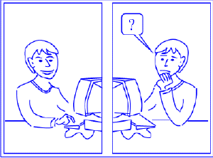
As we cannot think as users,
we have to somehow get to know them and their thoughts.For that, one can
conduct interviews or make observations of their workflow habits when they
do the task with current tools or application prototypes.User observation
is an option that is little used in everyday practice so far.I would like
to recommend that more observations be conducted as a very useful method,
especially when software developers are not making
the first version of the
product.For simpler services, an hour of watching a novice user may provide
valuable insights into the users' world.
One can read usability heuristics such as: users read the help only in deep trouble; good error messages are always essential; important things should be highlighted; search categories should be avoided whenever possible and many other such advice.These all seemed to me like reasonable, but their importance is only truly understood in real user tests.
Simple map manipulation
In my thesis, I concentrated
on simple Internet applications.More specifically, I studied four journey
planners.It is a kind of service that is meant for anybody, who has no
GIS education and the term "Pan" is related to kitchen.
In the tests, one of the tasks for users was to select their destination from map.It could be seen as a simple map manipulation where the user has to select a point from a map.Should not be too difficult, right? Unfortunately it was.Many different options for map manipulation were available in different services.Clearly, some of them seemed to work better than the others.The exact statistics are not even that important here.Let's explore what were the good options and some of the main causes of trouble:
When writing the theory part of my thesis I did not find any author who would have given advice about simple map manipulation.(I wonder if it is because detailed usability study results were found too valuable to share with others.) So, I put together my own list of recommendations, based on user tests and general heuristic guidelines.I recommend that the following tools would be available for simple map manipulation.
- Click on map: Zoom in and re-center.If it is possible to select something from map, then the place that was clicked should be also selected.Selection should have clear feedback - some mark on map together with a label.The label could be an address, a place or stop name, or when there are several of these, then all of them.Reselection should be possible with another click.
- Zoom level indicator: showing current zoom level and enabling quick change of scale.
- Zoom in and out tools: preferably on both ends of zoom level indicator.
- Eight arrows for panning: generally on the edges of map.
- Key map: to allow users to better understand what area is described on the primary map, and for quick re-centering.
- Browser's Back Button: displaying the previous map again.
- All tools and map itself should have mouse-over help.
- The tools that cannot be used any more (zoom in at maximum zoom, arrow on the edge of area covered etc.) should be disabled.

Click on image for larger
view.
An interface example, based
on the given recommendations.
Why develop software differently?
There were many reasons
for deciding like this, the four most important ones follow.
1.When the user cannot zoom
in with a click on the map, clearly the action takes more time and effort.
The user has to think, which arrow or zoom level to use.In both cases,
there was quite often hesitation.For example, I scroll to the south...no
southeast...then I zoom to level 2...no-no, not that way, rather to level
4.OK, this is the map I wanted.As in other service, this all was done
by one simple click on map.
2. A well designed
zoom level indicator gives users fast overview about the available maps:
whether it is possible to zoom in and out any more.Otherwise, the user
might think that maps that are more detailed are not included in the service,
especially when having some problems with zooming.
3.Though users liked to
use click on the map for zooming in, they also sometimes used the arrows
on the map edges.This was the case when the user wanted to preserve the
scale but just move the map for example towards
south.
4.Perhaps a bit surprisingly,
Browser's Back was also one of the often used tools in map manipulation.
This function was used mostly for zooming out, as users usually had had
the smaller scale map just before, but also in
many other cases.
In conclusion, I think that
the technological solutions for providing GIS Internet services are available
today.For increasing their number of users, we have to look also at the
usability side.For some, it requires a change of attitude, that besides
traditional bugs, usability problems should also be removed from the final
product.I see it as a challenge for us - the software designers - to make
software that the users can become productive quickly and correctly, and
be therefore happy.And come back to our service.