I came across an obvious example of this lack of visual communication expertise recently in the form of posters hanging in a university hallway. Ostensibly they were there to let others know what the researchers were up to in that particular science department. I presume they were originally made to display at professional conferences. However, if anyone within or outside of the department learns or has learned anything of substance from them I'd be surprised. All the posters had long titles with acronyms, enormous amounts of copy, and little else. In one instance the authors' names were in the same font size as the title!
Now, how in the world are these people getting their message across? Certainly not with these posters! The GIS profession is also afflicted with a lack of artistic design skills. We are a group made up mostly of analysts, programmers, planners, scientists and developers and have had, therefore, little or no formal training in the arena.
When we GIS professionals spend as little time and effort on the design of our map products as the scientists in that department spent on their posters, we come dangerously close to being ineffective. One major hurdle that GIS professionals often cite when discussing design is that they lack the time that it takes to make something look good. But, what about all the time wasted on products such as those department posters that aren't communicating anything and are therefore useless? It is much better to spend the time upfront to create a compelling map than it is to re-do the map at a later date.
 |
 |
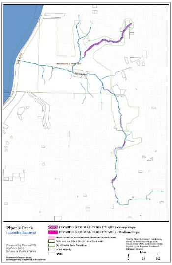
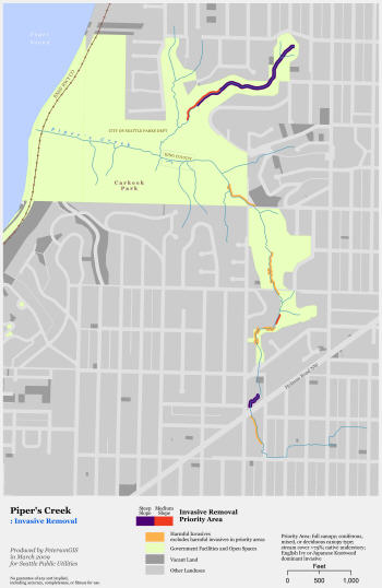
Good design means successful communication, period. Sometimes that means the map is made in such a way that it can be understood in a split-second, like a location map in a newspaper article. Sometimes it means the map is made for a lengthy perusal, such as a map of regional historic sites. However, even those maps need to have a design that invites immediate understanding at least at a cursory level. As Holly Glaser, principal of Mappa Mundi GIS, LLC explains, "Maps that do not deliver a clear message in less than 10 seconds will not be looked at by anyone. A simple map that conveys information without causing eyestrain or confusion is the best. Getting to this point requires ruthlessly pruning your darlings, such as fancy color schemes and extra legend items. It also requires making sure that the important information is easily seen."
This idea that it takes time and effort - again, because by and large we don't have the art background to make it easy - for us to make our maps is not to be taken lightly. Perhaps we are afraid of what will happen if we open ourselves up to the world of art and design in order to further our career skills. We all know what happens when someone gets the cartography bug. They collect maps, they spend hours on sites like the David Rumsey Map Collection and Strange Maps, they start taking design classes, they spend an eternity on each map they produce, they critique color palettes on COLOURlovers and they hang up complex font and color charts next to their desk. You may have even participated in my webinar, "Creativity and GIS". Yes, it's true that these things take you away from your primary responsibilities if you are not a cartographer. But we are all going to have to admit that these are necessary (and even fun) activities that we need to undertake in order to continuously sharpen our map making skills.
In my book, GIS Cartography: A Guide to Effective Map Design, I argue that because our profession is growing to include many people from design-heavy fields such as graphic design and landscape architecture, the rest of us are going to have to increase our cartographic skills simply to keep up. I can't emphasize that enough. We really are going to have to work on this simply so that we aren't left behind. However, there are many other reasons that we should be paying attention to our skills in this arena. Many times these reasons are specific to the kind of GIS we are currently practicing and that's what the rest of this article focuses on. Let's go through some fictional employee examples to learn more about them.
Local Government
Sally is a local government employee. She tends to work hard, is underpaid and overworked. On the flipside she does get a lot of vacation time. Should she spend that extra vacation time going to museums, gaining inspiration from beautiful landscapes, and otherwise expanding her creative repertoire? You bet. This is why: Sally is committed to public service. Part of this commitment is to produce map products that help her customer base - the public and elected officials - understand the political, social and environmental landscape in her city. Since a well-designed map is one that communicates its data as effortlessly as possible while giving maximum visual satisfaction, her extra work toward map design is important.
But what if Sally wasn't as committed to public service as she is? Would there still be some kind of incentive? Try this scenario. A citizen walks in to request a map of the zoning on her property and Sally has no pre-contemplated design template to use. Sally wastes time by creating something from scratch every time this type of request is made. In this case the upfront time cost is very much worth it in order to minimize time spent and mistakes made in the future.
Amanda H.S. Taub, GIS analyst for the Douglas County Transportation & Land Services, offers these thoughts. "Local government workers should spend the time making bunches of templates that can be used at fixed scales. This should even be done for the maps that are given out at the front counter for general inquiries about roads, properties, zoning, etc. Spend the time developing the look of the jurisdictions maps. The time spent doing this early will save so much time later when in a hurry."
Solo Consulting
Dan is a consultant working as a solo GIS practitioner. As a GIS entrepreneur, Dan knows that everything he produces must be of the highest possible quality and close to the leading edge of the industry. His map designs, even if cartography is not the main focus of his business, must be up to par with the best in the business. He simply cannot send a paying client a mediocre design. Sure, if he's shooting a quick jpeg to a client to explain a certain situation with the data he's manipulating he might take a quick screen shot, but for anything that is going to include an audience of multiple people and which is considered a work deliverable, time and effort must be put forth.
He may even deliver a map of some data he's putting together as an extra courtesy to his clients, though it hasn't been specifically requested. Dan sees an immediate connection between making his customer happy and gaining future work for his business. Making his customers happy through custom map designs that are well thought out, perhaps even worthy of the customers' framing and hanging, will keep them coming back for more.
Web Development
Sue is a Web developer. Her stance on cartography is that even a small investment in map design know-how is going to put her above the rest of her field. She is making a Web map for policy makers, who are non-traditional Web map users. She has to make it simple and inviting. If she can accomplish this in an aesthetically appealing way she can be the reason that better decisions are being made by the policy makers, who now have access to, and can view, spatial data without leaving their desks.
Because Web development in the GIS arena has focused so extensively on tools and procedures, the design aspect of the field is inordinately behind. It makes good sense for a Web developer to learn some design skills because, as the originator of a Web map, she is in the best position to design it well from the start. Even if she concentrates on learning only usability, color compatibility and element placement, she will go a long way toward enhancing the user experience. The value is realized in increased traffic to the site, increased interest in the data being mapped and better decisions being made. Two great starting places for this learning are:
- "10 Useful Usability Findings and Guidelines" http://www.smashingmagazine.com/2009/09/24/10-useful-usability-findings-and-guidelines/
- "Don't Make Me Think: A Common Sense Approach to Web Usability, 2nd Edition" by Steve Krug, Aug 28, 2005, New Riders Press
Dave is a GIS analyst in a large consulting firm. His firm has plenty of designers with whom he can work when he puts out a map. What's in it for him, then, to learn about design? In Dave's case, an investment in design skills learning can make it easier for his bosses to put him on billable projects. We're talking job flexibility. When projects are low, Dave can be used as a designer or a GIS analyst in order to keep his job.
He is also eminently more marketable when he is searching for a new job, as would be any GISer with multiple skills. When he goes to a job interview he can take samples of his analytical work - displayed as engaging and beautiful maps, of course - that are his own work. Now he is showing off two skills: cartography and analysis. He surely can't take in a map that the designers at his firm made, as that isn't his own work.
In Conclusion
As Christopher Walter, Geospatial Division director at the Cascade Land Conservancy, put it, "An ugly or poorly executed map will more than likely discourage the audience from investing the effort to find the message, while a map that is attractive, interesting or otherwise compelling (not to mention culturally appropriate) can be expected to reach a greater proportion of the intended audience." No matter whom you work for or where you work, the creative and design skills that you acquire through dedicated learning serve to justify an investment in GIS as a whole. After all, it is through the map product that most people, including your bosses and clients and the tax-paying public - the people who paid for the GIS in the first place - will interact