Ed note: In my humble opinion, data exploration
is always more effective when it is done visually. This article by
Richard Klavans describes mapping the relationships between scientific
publications based on specific topics. The relationships within and
between each of the collections of scientific literature are fairly
easy to see in the initial graphic. And it gets even better as you read
through the article. Be sure to look at the authors website. - Hal Reid, Editor
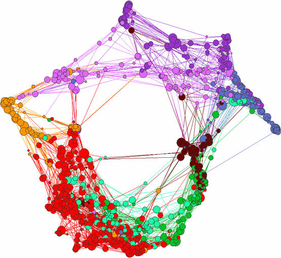
Each circular node in the following diagram represents scientific publications exploring a particular topic, more accurately called a paradigm. Over 1.6 million scientific publications were clustered into the 776 high-level paradigms shown below. The edges (lines between nodes) represent publications that are assigned to multiple paradigms. Only the most important edges are shown on this map in order to show the primary relationships between paradigms.
These paradigms are distributed in a ring-like structure. General groupings of paradigms include Physics (dark purple), Chemistry (blue), Earth Science (brown), Biology (green), Biochemistry (teal), Medicine (red), the Social Sciences (orange) and Applied Math (light purple).
The map of science can be used as a tool for science strategy and evaluation. For example, you can focus on a particular paradigm and drill down to gain additional information. One of the most important paradigms for drug development is selected (below left). Research in this paradigm covers most of the literature on proteomics, as well as other newly emerging methods that have their roots in chemistry and their applications in medicine. Information on the micro-structure and performance within that paradigm is provided (below right).
There are 8,982 publications in this paradigm. These publications are clustered into 455 research communities (a research community represents a group of researchers working on a specific topic). Measures of performance are provided at this level of analysis. Grey represents average science. Red is high vitality science (researchers quickly building on each others work). Green represents science that is supporting patent generation. And black represents high vitality science that is also supporting patent generation.
This map provides a highly accurate description of the scientific environment, and can be used to map an organizations strengths as well as locate competitors and potential alliance partners. This map is also an extremely effective way to gain a quick understanding of extremely complex areas of science.
Each circular node in the following diagram represents scientific publications exploring a particular topic, more accurately called a paradigm. Over 1.6 million scientific publications were clustered into the 776 high-level paradigms shown below. The edges (lines between nodes) represent publications that are assigned to multiple paradigms. Only the most important edges are shown on this map in order to show the primary relationships between paradigms.
These paradigms are distributed in a ring-like structure. General groupings of paradigms include Physics (dark purple), Chemistry (blue), Earth Science (brown), Biology (green), Biochemistry (teal), Medicine (red), the Social Sciences (orange) and Applied Math (light purple).
 |
The map of science can be used as a tool for science strategy and evaluation. For example, you can focus on a particular paradigm and drill down to gain additional information. One of the most important paradigms for drug development is selected (below left). Research in this paradigm covers most of the literature on proteomics, as well as other newly emerging methods that have their roots in chemistry and their applications in medicine. Information on the micro-structure and performance within that paradigm is provided (below right).
 |
There are 8,982 publications in this paradigm. These publications are clustered into 455 research communities (a research community represents a group of researchers working on a specific topic). Measures of performance are provided at this level of analysis. Grey represents average science. Red is high vitality science (researchers quickly building on each others work). Green represents science that is supporting patent generation. And black represents high vitality science that is also supporting patent generation.
This map provides a highly accurate description of the scientific environment, and can be used to map an organizations strengths as well as locate competitors and potential alliance partners. This map is also an extremely effective way to gain a quick understanding of extremely complex areas of science.
From Our Homepage
Saying Farewell to an Amazing Journey
Communicating with Maps
Is There a GIS Career Ladder?
What does it mean to be geospatially smart? Series
Ways Real Estate and Property Developers Utilize Melissa GeoData for Data-Driven Decisions
Unlocking Value From Daily Satellite Imagery and Insights
Maximizing the Value of Your Address Data with Geo Addressing
How Indoor Mapping Enhances the Security of Smart Buildings
Look Ahead: AI, Location Intelligence and Efficiency
Collaboration Takes on Sea Level Rise & Dynamic Technology Environments
Brownies for Brownfields
Has Everything Been Mapped Already?
How Is Data Literacy Changing in an Artificial Intelligence Landscape
Portfolios for GIS Professionals: More Than Just Maps
How to Create a Distance Matrix in QGIS - A Step-by-Step Guide
7 Ideas for Bringing GIS into the K-12 Classroom
The Geography of Movement