Come on, the technology the major TV networks purchased were far more sophisticated and capable of delivering more insightful spatial statistics than what was presented.CBS, CNN, FOX, NBC, and ABC displayed elementary, if not crude mapping technology and fell well short of my expectations.Not that what they had was crude...they had the tools; they just didn't use them to their fullest potential.
In on-air coverage, CNN and FOX had the usual state-by-state, red vs. blue standard (boring) maps; CBS had Dan Rather in front of this monitor using his beloved pencil again (seen it before...boring), and the depiction of the US map on the ice rink in front of 30 Rock by NBC left me cold.
CNN did attempt some additional analysis by using SpatiaLogic's technology, but again, they did not use it to its full potential.Instead, they could have pulled out a copy Strategic Mapping's Atlas Graphics software running in DOS from the 1980's to do the same thing.At one point, Bill Hemmer was examining the hotly contested state of Ohio and was discussing the results at the county level.Well, do tell, that was surely high-tech, wasn't it.CBS and ESRI had issued a press release regarding their use of mapping technology but I did not see evidence of it.Perhaps I missed it and if anyone saw it differently, please let me know.
I kept yelling at the screen for them to zoom in to the precinct level and show me a psychographic profile of why this particular demographic segment was influencing the voting patterns.Show me the detail of just how many white collar vs.blue collar workers live in that zip code; show me the breakdown by ethnic lines to understand how those segments of the populace were trending toward which candidate.Show me where the candidates were stumping the weeks before the election, by city, and correlate that to how the electorate voted.Now that's the kind analysis I expect to see given what I know, and you know, of how the technology can work.Really, that's just basic GIS analysis, and perhaps that's just about all the average viewer could appreciate.But given the demographic profile of a cable network subscriber who was watching the coverage, I suspect that they could handle the technological ingenuity that our cadre of software providers have provided these supposedly tech savvy media companies.
It was disappointing to say the least.And what was worse, the networks' touted the use of mapping technology as an incredible breakthrough for news coverage.Yes, it certainly would have been if they had read the user manuals.Could they have gone into less detail? In my mind, don't tout the fact that you are using maps and then fail to exercise the real power of the technology.The news media makes themselves out to be technology wizards, especially in visualization, but this was a clear indication that they don't understand how to leverage the technology to truly analyze the demographics that they so often look to in capturing the electoral trends.
Let's look at some of the examples provided by the online resources
of the TV networks:
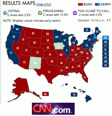
CNN Online: Zoom to county level |
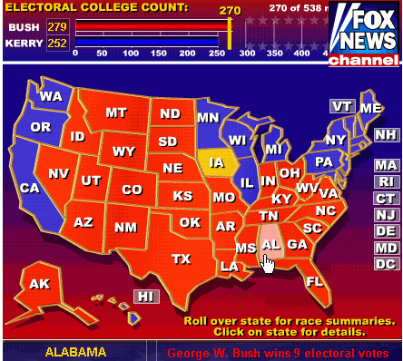
FOX: Fairly crude map; mouse over shows electoral votes to specific candidate only |

MSNBC: US Map Only |
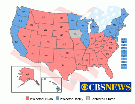
CBS: US map only |
Print media's online resources faired much better in my opinion.Thankfully,
our good friend at USA Today, Paul Overberg, Database Editor and ESRI user,
was working overtime to update their website every fifteen minutes during
the night, and held up the flag for print media.See below:
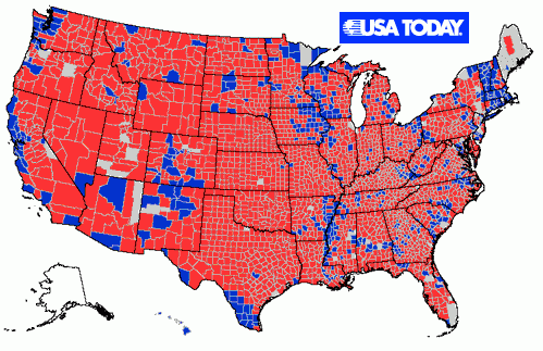
USA Today: Mouse over reveals percent of voters and popular vote |
So, in summary..note to the mainstream media....take a course in mapping sometime during the next four years.