- Geographic technologies help the user visualize and model the marketplace, but events in the marketplace occur in geographic space and time.Therefore, to optimize results, business decision inputs must effectively examine "when" as well as "where."
- As the pace of business quickens and analytic complexity grows, Retail Business Intelligence tools must be quickly understood, highly visual, and integrated into easily used workflows, so that line managers, not just analysts, can make rapid, accurate decisions.
Market events occur in
space and time
Among other measures, retailers
look at sales and traffic counts by store, by region and by time period.
The best example of this, for all of us who watch the evening news, is
the daily reporting of sales trends as the holiday season progresses.Restaurateurs
and convenience retailers talk about "dayparts" and radio programming and
outdoor advertising placements are designed to catch the morning and evening
"drivetimes." In the scientific world, public health practitioners look
at disease trends and exposures to biohazards over the course of months,
even years, where cancer is concerned.In government, census data are gathered
periodically and analyzed to reveal trends over time and geography.Time,
from season of the year to time of day, is essential to understanding the
context that drives real world phenomena, from health hazards to demographic
trends to retail business results.
Unfortunately, the tools we use to visualize and analyze marketplace data do not deal with time in a fluid and graphic manner.GIS are designed for the visualization of spatial data and are not perfectly suited for space-time data.For example, if you want to look at data over multiple time periods in a GIS, you generate individual maps for each time frame (even of the same geography) and look at each separately, or go outside the GIS to build a "flip chart" using Microsoft PowerPoint or a .gif "animator" to view them in sequence. That's because today's GIS are built on spatial, rather than space-time data structures, they cannot readily deal with space-time geo-referencing or space-time queries, and instead deal only with point-in-time data "snapshots." GIS maps are static, while the underlying data are dynamic.Let's take a moment to clarify the terms, static, animated and interactive maps.Static maps provide views of a fixed (unchanging) map.Animated maps change appearance as their content changes based on the value of a variable, usually time. Interactive maps may be static or animated, and allow the user to control the map's appearance and content interactively.Visualization and analysis of dynamic marketplace data will benefit greatly from tools that allow the user to animate and interact with maps and graphical data views.
The answer to the problem of GIS not incorporating time is to develop a new type of information system. The TerraSeer Space-Time Intelligence System™, or STIS™, is a revolutionary analysis platform recently developed to address this need.The TerraSeer STIS is not a GIS, nor is it based on GIS technology.STIS is a proprietary technology in which time is native to the spatial data structure (rather than included as one of a string of attributes).As a result, rigorous space-time queries, statistical analyses and data animations through space and time are possible.Using multiple linked data views (maps, graphs, tables, quadrant analyses, etc., user's choice) it can work with GIS and business data formats (shape files, databases, excel files, etc.) to visualize and support intuitive, dynamic business decision-making.Key features of the TerraSeer STIS include the following.
- Like a GIS, the STIS enables mapping, querying and graphs.Unlike a GIS, the STIS integrates time into the data structure, so maps, queries and graphs "move," letting the user visualize data changes through time.
- Multiple data views (maps, graphs, tables, at user discretion) are linked so that features highlighted in one view are simultaneously highlighted in all other views (this capability is referred to in the literature as "cartographic brushing").
- Animation capability shows data "movies" through space and time.
- Built-in spatial and spatio-temporal statistical tools let users see change over time and test its significance, without having to export to another software tool.
- Fully GIS compatible, loads shape and database files, STIS can be used with a GIS or on its own.Export formats are STIS project files and shape files.
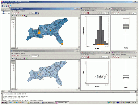
The first three figures demonstrate STIS animation capability and the insight this approach can provide.These data come from the public health domain and are available from the National Cancer Institute, showing counts and rates of colon cancer among different demographic groups from 1950 through 1994.The geography is State Economic Areas (SEAs) in the Southeast U.S.
Figure 1.Baseline Time 1/1/1950. In this screenshot the user has created maps of cancer rates among white males (upper left) and white females (lower left).Higher rates of cancer show up in darker blue. Box plots of each groups' rates are shown at upper and lower right.A histogram (or frequency distribution) of male rates is shown at upper center while a scatterplot with male rates on the x-axis and female on the y-axis is below it.The user has identified the areas with highest male rate in 1950 by "brushing" a selection box on the male rate box plot (upper right).He can now readily see where these areas fall in the linked map and graph views (orange highlights), and can easily track them through time as the data are animated.
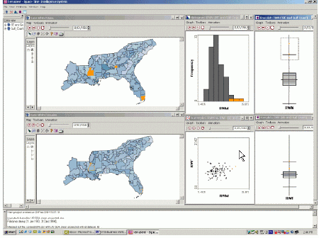
Figure 2.Interim Time 7/1/1972. After highlighting the male cancer rate outliers in Figure 1, the user pushed the "play" button and data in all views are moving through time and space at 6 month intervals, now paused at 7/1/72.Note how the rate of male cancer appears to be increasing while that for females is not. Indicators of this change are; male map getting darker blue, male box plot moving up while female is not, histogram bars moving to right and points in scatterplot moving right but not higher.It is also interesting that one of the areas with high male cancer rate in 1950 now shows well below average rate.This is the small area seen at map center and the rate variability is likely due to small population size.
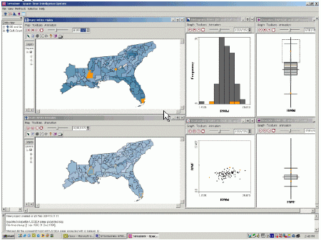
Figure 3.Time Endpoint 12/31/1994. The trend detected in Figure 2 has continued.We see clearly higher rates for males, while female rates are essentially unchanged.This dynamic relationship in the data is made readily apparent by space-time data animation and linked data views and, now identified, can be further explored by public health authorities.Beyond public health, this technique is fully applicable to all data that are space-time dependent.Rates of consumer goods purchases among target groups can be as easily examined as health rates.
Retail Business Intelligence
- Potential, Problems and Key Opportunities
Business Intelligence (BI)
is the large category of enterprise software that enables businesses to
run more efficiently by gathering data from across the enterprise and processing
it for use by managers and analysts in decision-making.BI is growing due
to its great potential to streamline and enhance business processes.Despite
its potential, BI faces two key problems, with attendant opportunities.
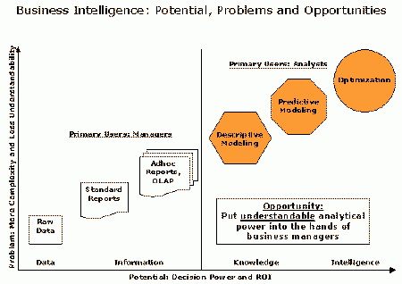
1.BI has done a great job with data efficiency, delivering the right data to all the players in the enterprise. The next opportunity lies in decision effectiveness through advanced analytics.According to a recent IDC study, "Business analytics implementations generated an average 5-year return on investment of 431%." The study also states that organizations that have "successfully implemented and utilized analytic applications have realized returns ranging from 17% to more than 2000%, with a median ROI of 112%." The problem is that modeling the business environment to accurately predict decision outcomes is typically handled by analysts, not the managers charged with making and implementing decisions.As a result, use of advanced analytics is not widespread and managers often do not give it the credibility it deserves. The greatest opportunity for BI today is to place easy to use and powerful analytical tools in the hands of business managers.Figure 4.As decision power and ROI rise, complexity grows and understandability suffers. This relationship can be changed through visual, interactive technology.
- 2.Especially for Retail,
the BI category has not provided business leaders with geographically enabled
tools that easily support the retail management style. The dynamic,
fast-paced environment of retail extends from the individual store, through
the market and regional level, to the executive suite.Every day, retailers
confront high-impact decisions that require immediate resolution.These
decisions must be based on the best information and analysis available,
formatted to support the intuitive decision style native to many retail
business leaders.The key opportunity for retail BI is to provide a platform
that allows managers to:
- Visualize their business networks in a dynamic and highly communicative interface, and
- Reveal key relationships in a way that fosters intuitive and fact-based decision making, without needing analysis expertise or data "geeks."
- How are stores, markets or regions performing vs.sales forecasts and potential?
- How do results vary in response to competitive pressure, marketing spend or capital investment, and what can we learn from the differences?
- What is the impact of key sales or management personnel?
- When is consumer demand highest and where should we build new stores?
Figure 5.How are stores performing versus plan, and what management actions are needed? In this screen shot we see two maps of a suburban retail territory, with a quadrant analysis of sales vs.plan in the center.Clusters of expected performance, i.e., high sales/ high plan and low sales/low plan, are shown in red and blue respectively on the right hand map.The manager has easily called up these three data views then used her mouse to highlight the unexpected, low sales/high plan quadrant of the graph.The stores/territories thus selected are simultaneously highlighted in orange on the maps so she can see the spatial pattern and contact or visit the stores to help diagnose and correct the shortfalls.
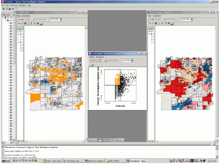
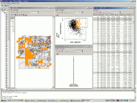
Figure 6.Which are the best territories to implement a new promotion targeted to affluent families with small children? To answer this question, the manager pulls up the database of stores (screen right), a simple scatterplot showing households with children under five on the x-axis and white collar households on the y-axis (top center), a box plot of sales by store (bottom center) and the market map.She chooses stores for the test by highlighting the upper right of the scatterplot (highest incidence of young kids and white collar households), simultaneously showing the stores/territories on the map and checking by means of the box plot that she is getting a cross section of sales performance (orange dots distributed from top to bottom).The database is linked to marketing and mailing resources so that selected stores will receive the appropriate in-store materials and direct mail support for the market test.
Conclusion
This article has discussed
using a Space-Time Intelligence System to develop a complete understanding
of market dynamics, and communicating it with animations and linked views
that encourage intuitive interaction and clarify decisions for non-technical
users.But space-time data animations, cluster analyses and scatterplots
are not the main points, they are means to an end.For geospatial technologies
to take their place in the business mainstream, the destination must be
usability.Business analytics, though powerful, are meaningless unless
decision makers can easily interact with the information they need to do
a better job.That's when they'll use technology and that's what these
cutting edge tools can deliver, the "sweet spot" where human experience
and intuition are enhanced by interactive technology.