Articles in this series:
Usability and the GeoWeb: Part 1 of ?
Usability and the GeoWeb Part 2: Provide Feedback
Usability and the GeoWeb Part 3: Protect Your Users From Themselves
Usability and the GeoWeb Part 4: Make it Fast
This post is the second in a multi-part series on usability in web mapping applications. Dave [Bouwman] has spoken extensively on this topic of late... and much of this is just putting fingers to keyboard on the issues we've been harping on for some months now. The first post in the series asserted that we, as developers and architects of these systems have a tendency to make things too complex and flood the user with all manner of features, functions, and data layers they don't need. In essence, the age of GIS in a browser is ending (I sincerely hope) and we're moving toward highly performant, intuitive, and focused applications in a browser that serve a particular purpose, and do it very well. Why? Because someone else is bound to be offering the same stuff you are, and if they can provide the information faster, they win... bye, bye users and bye, bye clients.
 Part
1 discussed hiding unnecessary complexity from the user, while our
lesson plan this time around uses extensive feedback mechanisms within
a site to keep the user on our side and make them feel comfortable when
visiting our site. A confident user is a comfortable user. A
comfortable user gets what they need and gets back out fishing,
golfing, spending time with their kids, or otherwise doing something
else besides staring blankly at your interface.
Part
1 discussed hiding unnecessary complexity from the user, while our
lesson plan this time around uses extensive feedback mechanisms within
a site to keep the user on our side and make them feel comfortable when
visiting our site. A confident user is a comfortable user. A
comfortable user gets what they need and gets back out fishing,
golfing, spending time with their kids, or otherwise doing something
else besides staring blankly at your interface.With that, here's lesson 2...
Lesson 2: Provide Feedback to the User
Nothing presents a bigger usability hurdle than a mapping application that leaves the user wondering, "Well this looks cool, but what do I do?" This is the principal downfall of applications that try to shove GIS into a browser.
 |
Geodevelopers know exactly what to do with three different toolbars and four menus containing all manner of map navigation, query, buffer, and analysis tools but open workflow applications with no guidance are intimidating to line of business users and the public. The web mapping industry at large must learn to develop applications that satisfy specific workflows and to lead users through those workflows within the application with visual cues and feedback in the UI.
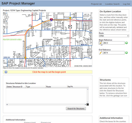 |
The roadway manager introduced in Lesson 1, uses the interface shown above to specify the begin and end points of a roadway project. First, note the simple informational panels that appear in the right hand column of the site to explain how to use the features on this page. Second, accept that a GIS professional knows that when they click a pencil icon, they expect to draw something on a map, but a roadway manager does not necessarily connect these two actions. Thus when the user clicks the pencil icon to set the begin or end point, information appears below the map telling our roadway manager what to do next. "Click the map to set the begin point." It's as simple as showing or hiding a "div /" element in the page, and it is a critical usability feature that is often overlooked.
Hold the User's Hand
I've recently read a couple of typical user workflows for web mapping applications that read something like this:
Step ï¿1⁄2 ï¿1⁄2 ï¿1⁄2 User Action
- Draw a polygon on the screen
- Intersect polygon with parcels
- Create report on parcels within polygon
- Find a facility by name
- Turn on critical infrastructure layer(s)
- Find electrical infrastructure by id and zoom to it
- Close application
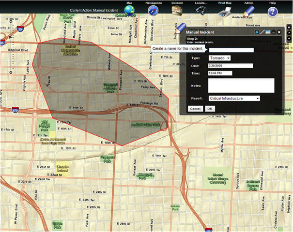 |
Now have a gander at the app shown above. The workflow that this particular application functionality supports is as follows:
Step ï¿1⁄2 ï¿1⁄2 ï¿1⁄2 User Action
- Draw a polygon on the screen
- Intersect polygon with parcels
- Enter attributes for polygon
- Intersect polygon with parcels/infrastructure
- Turn on critical infrastructure layer(s)
- Generate report of affected facilities
- Close application
- When the user activates the dijit by clicking on a menu item, they are prompted immediately to draw a shape and are informed on how to close the shape/stop drawing...a double click.
- Once the user closes the shape, the data entry interface pops up and says "Hey, I need some data!".
- As each field is filled in, the form keeps squawking for more data until it has what it needs.
- Since we already know the user is going to want to generate a report after we do our intersect and save all this data in the database, we ask them which one they want from the get go.
- On ‘OK' the system goes away, saves the polygon and attributes, does a bunch of processing steps and pops up the needed report.
Reassure the User
When a GIS Professional executes an attribute query or runs an intersect operation, they typically understand that sometimes, the result set is empty. The public, or some other non-GIS user, gets very nervous when they perform an action and are either presented with an empty UI, or are otherwise redirected to something they didn't expect. Did they delete something important? Is the request still processing? Did the site crash? "What the heck happened to my data?!?"
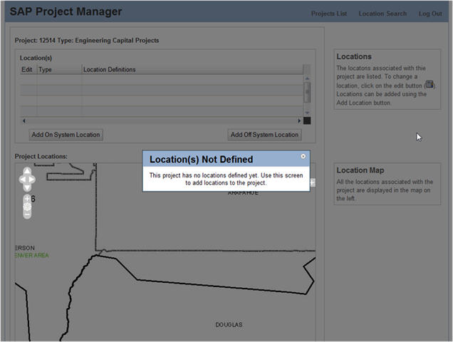 |
The importance of reassuring the user anytime something out of the ordinary happens cannot be over stated. Continuing with the roadway manager example, the figure above illustrates a case where the user has selected a project with no location information. Rather than showing the user an empty interface, leaving her to worry about what has happened, the map interface is zoomed to the general area of the project (known from tabular information) and an informational dialog explains that there is no need to worry and provides instructions on how to remedy the missing data issue. There is no need for a complicated exception or null case scenario; a simple modal dialog addresses the usability issue and keeps the user on the right track.
Up Next
Stay tuned for part 3 in the series dealing with strategies for protecting the user from themselves.
From Our Homepage
Saying Farewell to an Amazing Journey
Communicating with Maps
Is There a GIS Career Ladder?
What does it mean to be geospatially smart? Series
Ways Real Estate and Property Developers Utilize Melissa GeoData for Data-Driven Decisions
Unlocking Value From Daily Satellite Imagery and Insights
Maximizing the Value of Your Address Data with Geo Addressing
How Indoor Mapping Enhances the Security of Smart Buildings
Look Ahead: AI, Location Intelligence and Efficiency
Collaboration Takes on Sea Level Rise & Dynamic Technology Environments
Brownies for Brownfields
Has Everything Been Mapped Already?
How Is Data Literacy Changing in an Artificial Intelligence Landscape
Portfolios for GIS Professionals: More Than Just Maps
How to Create a Distance Matrix in QGIS - A Step-by-Step Guide
7 Ideas for Bringing GIS into the K-12 Classroom
The Geography of Movement