What is the connection between sports and geography? In these turbulent times, sports can bring us together across boundaries both regional and global. Of course, they can divide us with rivalries, as well, but with the relatively recent advent of globally televised events, they offer us a commonality of shared experience.
Things are heavy these days. We lose sleep over things we can’t control: elections, geopolitics, Covid-19…and who wins the next playoff game. Yet that lack of control over a game offers us a means to escape reality and a connection to the greater world.
Sports have been a part of human civilization since the ancient days. A Greek soldier ran the first marathon in AD 460 in a time of war, and the race has continued in many forms to this very day. The ball court games of Mesoamerica may have led to the modern games of soccer and basketball.
WUPA ball court (Photo from Chris Wayne)
For semantics, I’ll use “sports” as a general term for any competitive event. While most are athletic in nature, some are also contests of the mind, like chess, spelling bees and everyone’s favorite, (THIS… IS …) JEOPARDY! [RIP, Alex Trebek.] In this article, we’ll explore how geospatial technologies, sports and geography are all interrelated, and what we can learn from these interconnections.
The national weather report
One of my Saturday morning rituals every fall is ESPN’s College GameDay show. As much as I enjoy watching the games, I also enjoy the armchair travel around the country. Every game preview offers weather conditions and pictures of campuses from Seattle to Miami. With a few clicks of the remote, we can visit the Willamette Valley of Oregon and the Piedmont of the Carolinas.
Using a range of data, primarily from social media, sbnation.com has developed a series of maps showing college football fandom. What makes these maps fascinating are the questions to which they lead. My alma mater, Indiana University, has one of the worst football programs in the nation historically, yet in one map we dominate south Florida and parts of Virginia, while in Alaska, Auburn University in Alabama is the favorite team. Though the data may be spurious, they could indicate other metrics, such as alumni diaspora.
What is also interesting to sports fans, geographers and educators, is how the maps change over time. Again, the data is gathered and conflated mostly from social media, so human behavior is certainly a factor. As professionals, whether reading or making maps, we always need to ask ourselves: How are the data derived and from what sources?
Vector or raster?
I love heat maps, and (compassionately) force my students to make them, challenging as they may be. Students are free to use whatever interpolation method they choose, as long as they document their methodology and explain why they chose that method. As inspiration in fall quarter, I offer this map of College GameDay locations. Based on empirical data, it shows where this program has been hosted since 1993. As you can see, the Southeast is football central.
We also do vector analysis. A great example I use is Business Insider’s maps of baseball fandom across the U.S. By mining consumer purchasing data from Seatgeek.com, an entertainment sales outlet, they made maps at the county level. Again, the data is subjective, since it is based only on those who shop at Seatgeek. Nevertheless, as an educational tool, it illustrates how data from different sources can be overlaid to reveal patterns and answer questions we never might have thought to ask, like: Which MLB’s fan base covers the most land area? (Seattle Mariners, thank you Alaska.) Which one covers the most counties? (Atlanta Braves) And which state has loyalty to the largest number of different teams? (Pennsylvania)
Similar to the Business Insider map series, Vox offers “40 maps and charts that explain sports in America.” Along with maps at the national scale, they drill down to the court level of a NBA game, showing the path of the ball during the 48 minutes of play time. These offer a fascinating panorama of data-based infographics, using not only maps but also charts and graphs for data visualization.
A world united…or is it?
Even in the most divisive times, there are still reminders of our human commonality. The Olympic Games and the World Cup capture the attention of the whole world for weeks at a time. There are certainly rivalries, and we root for the “home team,” but we also embrace the unity and the sportsmanship, and know that people all over the world are also watching.
Vox, in the same vein of the American sports infographics, shows “22 maps that explain the World Cup.” Like many of the maps previously mentioned, the data sources are diverse, many from Wikipedia Commons. Should they be taken as authoritative data? Some are empirical, such as the locations of stadiums in Brazil, while others, like fandom, are more subjective.
Although I’m not a soccer fanatic, I pay casual attention to the World Cup because of its global scale. On the other hand, every two years I am glued to the Olympics for a month. The Olympics bring us global unity, but delving into maps and infographics reveal a different side.
Cartograms can be difficult to digest at first. They show the world not by geography but by statistics, changing the shape and size of countries into, sometimes, unrecognizable shapes. This cartogram of medals won at the Summer Olympics from 1896 to 2012 makes Europe and East Asia look enormous, while Africa is tiny, despite its much larger size. A similar cartogram shows the same pattern: the wealthy nations of Europe and North America swell, while poor countries shrink almost to invisibility.
The guilty pleasure mitigated?
According to some studies, the NCAA men’s basketball tournament costs billions of dollars in lost productivity as people watch games online, take sick time to watch their favorite teams on TV, fill out their brackets and have debates and discussions with colleagues in the break room. I admit I’m guilty of that, but I’ve justified it by building classroom exercises that I also share in the workplace. Others have done the same.
In 1987, my Indiana Hoosiers won the championship against Syracuse University on a last-minute corner shot in New Orleans. The teams were equally talented, but was there more to that victory than talent? Brian Ward and Brian Davenhall explored this question in their article about travel time and distance during that twenty-day tournament. They sought to examine “possible predictive correlations between the distance traveled by a team competing and its likelihood of prevailing.” Unfortunately, the study was inconclusive, and further analysis is required. Sounds like a good use of work time…
From Pop Warner and Little League to the professional Big Four (NFL, NBA, NBA, NHL), sport involves a lot of travel and logistics. Many of our family and friends have hockey kids and travel across our great land. Similarly, so do professional teams, with not only players and staff, but literally tons of equipment, consuming immense amounts of fossil fuel.
In 2016, Max Kaplan of Princeton Sports Analytics built a map to “optimally realign the NFL divisions to minimize travel time (and greenhouse gas emissions) in honor of Earth Day.” This is slightly outdated, since the Raiders have since moved to Las Vegas and the Chargers to Los Angeles, but it is a good illustration of applied geography and simple but purposeful spatial analysis.
It didn’t begin with radio and TV.
As long there has been civilization, there have been competitive contests. War is the most obvious and horrific implementation, while peaceful competitions have advanced cross-cultural communication. The Olympics and World Cup are modern manifestations, but there are also ancient examples.
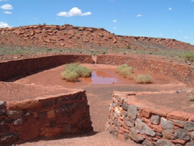
With hip pads and a latex and/or stone ball, ancient Mesoamericans played what is simply called the ball game. Ball courts were built for centuries; the earliest known is over 3000 years old. Although primarily in Guatemala, Belize, Mexico, Honduras and El Salvador, ballcourt ruins and artifacts have been discovered in the American Southwest, and several are preserved at Casa Grande Ruins National Monument and Wupatki National Monument, which were hubs for trading.
Unity and engagement
Mapping the geography of sports is a wonderful topic to introduce students to the power and possibilities of geography. This subject can grab the attention of students of all levels. For primary students, it’s a great after-recess exercise!
It can be as simple as a pin map of your favorite teams in any sport (use different colored pins for different sports), or as complex as a travel-time analysis. My go-to exercise for college students is to download a state boundary map and a bracket (most of them are filling it out anyway), then count the number of basketball teams from each state and add that as an attribute, then make maps with different classification methods. They don’t realize they’re actually learning something, until they do. Go Hoosiers!