My work has always sought to build bridges between GIS and other disciplines to foster spatial thinking, problem solving, and content knowledge. I wrote the following activity as a bridge between mathematics, statistics, geography, and GIS for secondary schools, universities, and for GIS professionals. I also wrote it to raise awareness that charts, including scatterplots, are a part of the ArcGIS Online toolset that can be easily used and yet offers powerful insights into patterns, relationships, and trends. This activity, also, is keenly aligned with helping people using analytical tools, including GIS, to be critical of the data, realizing that their analysis results hinge on the scale and the quality of the data they are using.
In this lesson, I invite you to analyze two sets of two variables each — mountain peaks (elevation/difficulty of climb) and median income/median home value. I like to choose variables that are interesting (and even fun!) to use, and those that are relevant to societal issues of our time. I also chose the variables because one set of variables is related, and the other is not. Can you guess which set is related?
You will use ArcGIS Online for this activity. Note that this activity does not require you to have an ArcGIS Online account; you can use it as outlined below without any ArcGIS Online account. If you do have an account; that is, an organizational login, you will have the added benefit of being able to save your results. Open the following web map: https://www.arcgis.com/apps/mapviewer/index.html?webmap=4168c7a43f6d423dad872796af9f9c9e
The map opens showing the state of Colorado, U.S. with two layers visible: Colorado 14ers (peaks over 14,000 feet [4267m] in elevation), and American Community Survey county-level housing and income data from the U.S. Census Bureau.
To the left of the map, use Layers > Turn off the ACS layer > so that only the Colorado mountain peaks are visible. Open the table of data behind this layer > note that 58 records exist, the number of peaks that meet this elevation. These peaks are rather famous in the Mountain West, are popular for hikers, and also serve as a “badge of honor” when asking people, “How many Fourteeners have you climbed?” Note that a field exists named Elevation, and another exists named Difficulty. The difficulty are ranked from 1 (most difficult) to 58 (least difficult). The criteria used to generate the difficulty includes (1) climbing duration and challenges inherent in the trek, (2) terrain stability, (3) cliff exposure, (4) presence of a trail, (5) elevation gain, and (6) total roundtrip hike distance.
Think critically about the data. The difficulty is really an index that incorporates six different criteria. Indices, whether for climbs, or the Human Development Index, or a “rank of the 100 most livable cities,” or any other index, have their pros and cons — they are easier to use than a large set of variables, but they may incorporate subjective elements and may mask some aspect of the phenomenon that we are studying.

A map of Colorado “Fourteeners,” mountain peaks that are at least 14,000 feet in elevation.
Note the presence of mountains in Colorado from the locations of Fourteeners and the shaded relief base map that is in use. What is the pattern of these tall peaks in the state? From the map, do any of them look intriguing enough for you to climb? Which peaks are clustered in close enough proximity where you could possibly climb more than one over the course of a few days, or even more than one peak in a single day? I climbed Mt. Lincoln and Mt. Bross during a single day in the past, so I know it is possible!
Is there a relationship between elevation and difficulty? To find out, create a chart and create a coefficient of determinations fit on that chart. To the right of the map > Configure Chart > Add Chart > Scatter Plot > Data > X-axis: Elevation. Y-axis: Difficulty > Show Linear Trend (the coefficient of determinations) > observe your chart (shown below). Hover your touchpad or mouse over some of the points on the scatter plot to observe their values (elevation and difficulty).

Based on what you know or may need look up about the R squared value and what it means, is there a relationship between difficulty and elevation? How strong or weak is it? Why do you suppose this is the case?
Next, turn on the layer ACS Household Income Distribution Variables. Note that this U.S. layer has already been filtered to counties in Colorado. > Expand the layer > County > and just as you did for the mountain peaks, Configure Charts > Add Chart > Scatter Plot > This time, for the X-axis: Median Household income in past 12 months > Y-axis: Median Home Value for owner-occupied units > Show linear trend (shown below).

Traditionally, it has been more expensive to build homes in the mountains, and the amenities, such as ski areas, tend to make it more expensive to live there. Use your mouse or touchpad to click on a point in the scatterplot where the home value is high and the household income is high. Use the Shift key to select additional points (or use shift-and-band an area on the scatterplot to do so).
Again be critical of the data. I worked for years as a geographer at the U.S. Census Bureau and love demographic analyses. But like any data, census statistical data has limitations and challenges. However, it is very useful. For more on data quality in mapping, see our Spatial Reserves data book and blog.
Because you are using a GIS, you are not confined to scatter plots; you can also make bivariate maps of these two sets of variables. Therefore, in the next steps, map the elevation and difficulty data. Start with the following:
On the left side of the map: Layer > Make the 14ers layer active. On the right side of the map > Styles > Add field > add elevation. Observe patterns. Then: Add field > Difficulty. Observe the pattern on this multivariate map (shown below).

Map of elevation and difficulty of Fourteener Mountain Peaks in Colorado.
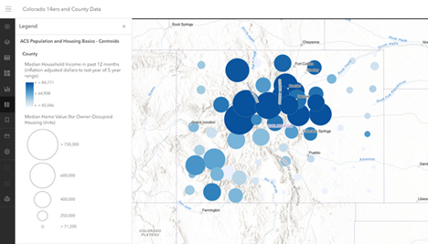
Next, map median home value and median income as a bivariate map. On the left side of the map: Layer > Make ACS population-housing layer active. On the right side of the map > Styles > Add field > add median income. Observe patterns. Then: Add field > Median home value. Observe pattern on multivariate map (shown below). Note that not all of the high home value and high median income counties are in the mountains. Why is that the case?
Based on what you know about the meaning of the R squared value, is there a relationship between median home value and median household income? How strong or weak is it? Why do you suppose this is the case? Do you think the same relationship would exist for other states?
Use the “lower” symbol to minimize the area occupied by the table so you can see the map at the same time as the table. At which locations in Colorado are these higher income and higher home value areas? Do these areas correspond with the most mountainous areas of the state? Conversely, repeat this procedure for the lower income and lower home value areas in the state, noting any geographic region(s) in the state in which these are concentrated. Do these areas correspond to the Great Plains region of Colorado to the east and the canyons and high plateaus of the northwest part of the state?
Take this extra challenge: Change the location of the mountain peaks to another area, such as California, Alaska, or even Nepal. Obtaining the elevation of other peaks will be easy, though it may be a bit more challenging to find a layer of difficulty of climb. Once you obtain these two variables, create a scatter plot and a map of the difficulty vs. the elevation. Are they related in other regions? Or are they, as in the case of Colorado, not related?
Take this extra challenge: Change the location of your study on income and home value analysis to an area other than Colorado. Make a map of these variables in, say, Illinois or South Carolina. What patterns do you notice? Create a scatter plot in those states. Are the two variables related, as in the case of Colorado counties, or not? Why? Change the scale of analysis and study census tracts or block groups in a city, or in a rural area.
Take one more challenge: Change the style of the symbols and create a relationship map instead of a bivariate map. On the relationship map, note the additional insights that you gain.