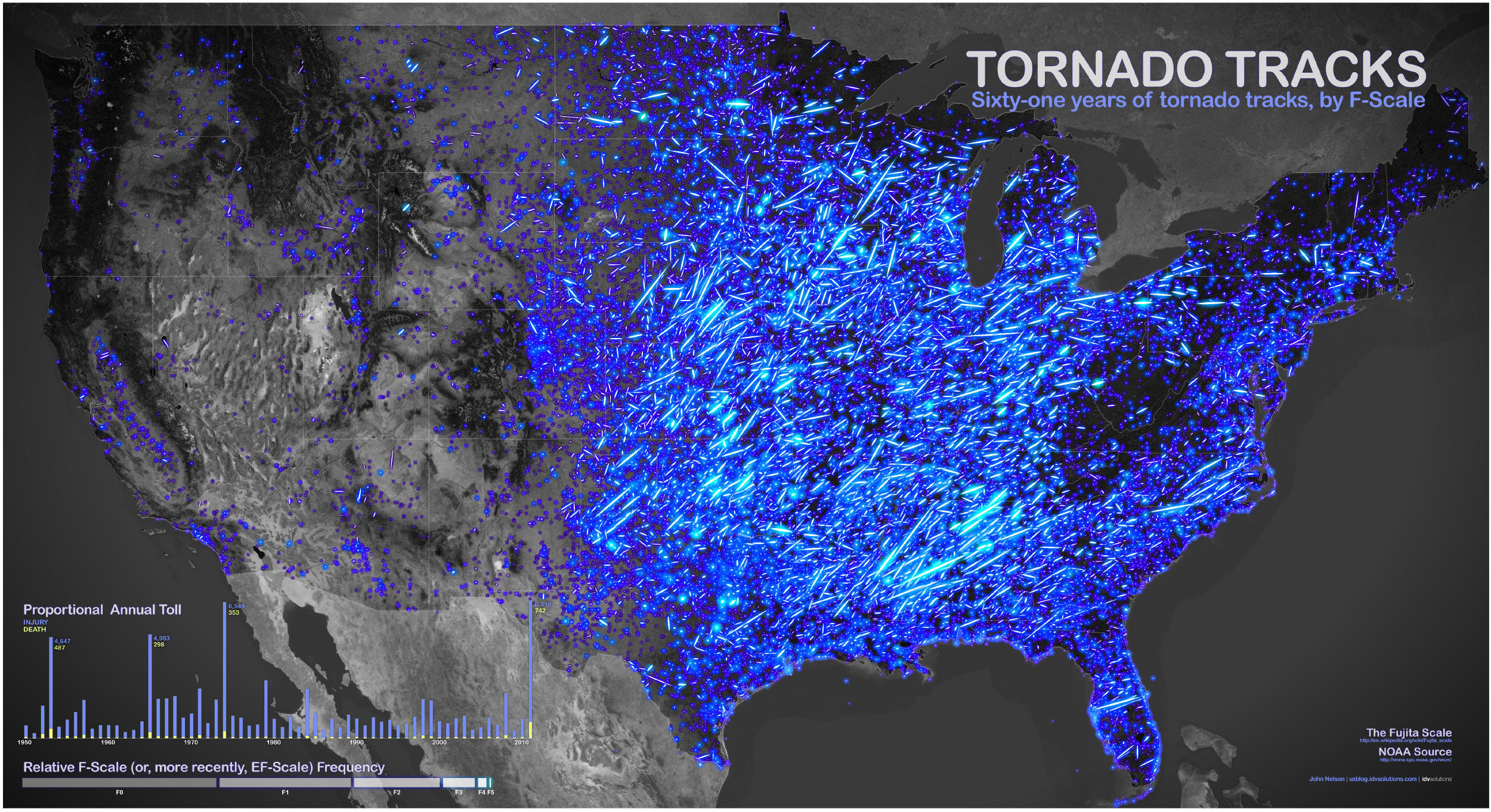
Some months ago, while consulting with one of our customers at IDV Solutions about data sources that represent broad global risk, I rediscovered a file of historic tornado path information that I’d downloaded from Data.gov a couple of years earlier. Blowing the dust off of the data I took a quick preliminary look and was immediately… disappointed. There were thousands upon thousands of elements stacked here and there in a dense thicket unevenly spanning much of the United States – a dataset I feared would require lots of filtering and massaging in order to be made “useful.”
With the benefit of a more thoughtful look I began to appreciate variability in the dispersion of the data, and the fact that there were tons of data began to reveal itself as a benefit rather than a chore. These data did not need to be crammed into a county or state rollup, or simplified and reduced. The value of these data lay in the very fact of its abundance. So I separated the tornadoes out by intensity, painted them as commensurately bright arcs of light, and lobbed it all onto a black and white satellite basemap to provide a reference. In all, it took a couple of hours, and much of that was spent figuring out pivot tables for a companion chart. Then I tossed it onto my blog, which I had generally thought of as relatively obscure. The map was picked up by a couple of aggregators and then made its way into some articles. Soon I was finding references to it in many venues, and always the comments section was an interesting sequence of questions and volunteered insights from not just experts but also non-specialists who found it interesting enough to do their own research. I was thrilled! As a map maker, it is exciting to see your work communicate a message, but it is much more exciting to see it spark conversation and see where the message goes in the wild. I’ll elaborate on this in a bit.
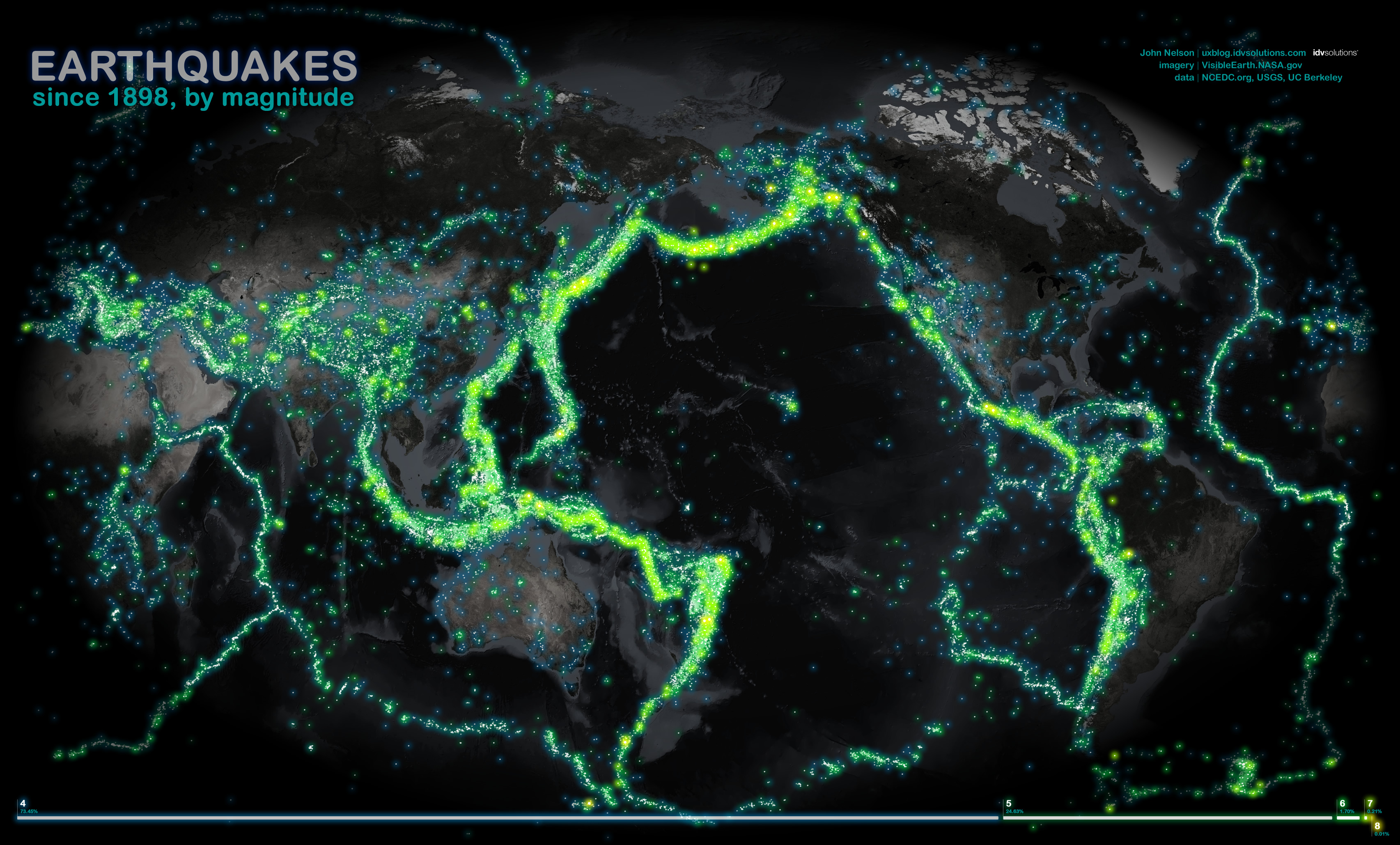
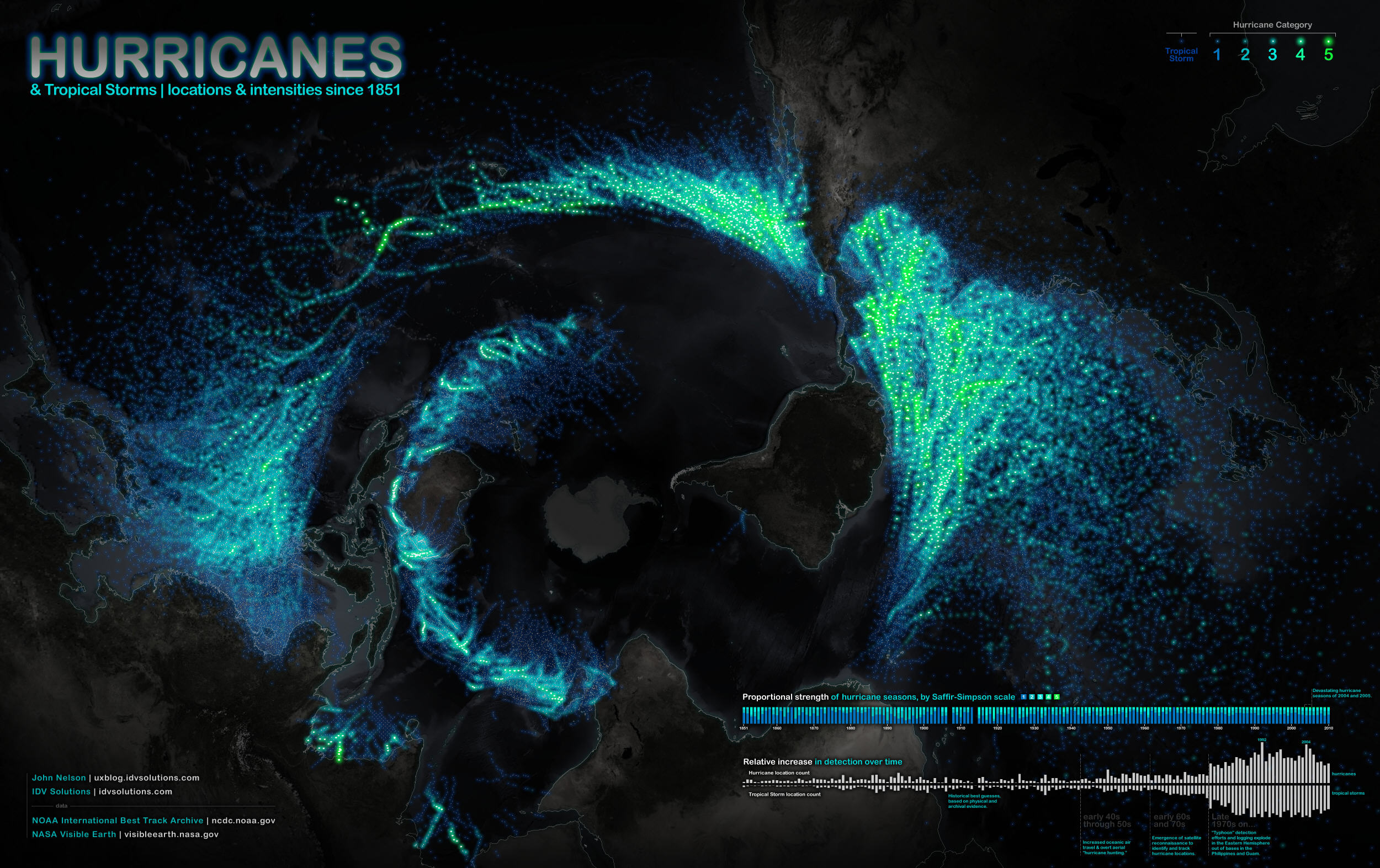
In any case, I followed up the Tornado Tracks map with an Earthquakes map that went back to 1898. Following that was a map of major fires over a little more than a decade, and more recently a visualization of every recorded hurricane since 1851. All four maps are singular in subject, data heavy, and arrange themselves into interesting geographic patterns that beg questioning.
Why did people find these maps interesting, particularly emergency managers? I was asked this several times and I did a fair bit of mumbling and guessing. Though, with the benefit of time, I have a hunch at why these maps became a topic of interest. I suspect it is the combination of five things…
- Interesting Topic. The subjects of these maps inherently represent risk, which we want to understand.
- Unexpected Scope. A forest view of something that’s usually seen at the tree-level offers satisfying perspective.
- Big and Clear. A single dataset is conceptually simple, and when large enough, it provides its own context-promoting conversation in the wild.
- Sharable. A static image is portable and paste-able, easily nestling into articles, blogs, tweets, and PowerPoints.
- Attractive. The currency of design buys a second or third look.
Interesting Topic
I don’t suppose these maps would have got as much notice if they plotted a dataset with less inherent interest. Admittedly, there is a certain amount of sensationalism about disaster maps and I hesitated making the second… and third. I was embarrassed at the prospect of being thought of as capitalizing on suffering or glorifying the tragic. However, the conversation surrounding the first map illustrated that it was a helpful resource to emergency managers and public safety officials in their efforts to educate the public. I’ve been asked by many managers and educators for permission to use these in their presentations and of course the answer is yes. They can be found, with some surrounding description, at uxblog.idvsolutions.com, where there are also links to the high-resolution digital versions and printed options.
Unexpected Scope
Usually a map relating to tornadoes, earthquakes or fires (and the like) focuses on a specific major event. We are accustomed to seeing news graphics of a tornado’s swath, an earthquake’s impact radius, and a fire’s footprint associated with a specific instance. Alternatively, when illustrated in a singular map with broad time and geographic scales, readers get a fresh take with a bit of leg room and may gain perspective that is both surprising and refreshing and may lead to insights (or at least illustrations of known concepts) about the nature of the topic. The United States federal government does a tremendous job of compiling and baselining large historic datasets and making them readily available to the public, and I encourage everybody to take a look at what is available, starting at Data.gov.
Big and Clear
Each of these maps broadly illustrates a single topic with loads of data. The intersection of a clear topic over a vast span of space and time forms a message that is both clear in concept (this is what it is) and thorough (here is where it happens) and makes it easy for conversation to grow around it. Maps like this do not offer explicit conclusions but rather present the evidence as stimulus for questions and conversation. And when map readers get to participate in the discussion rather than consume the analysis they leap at the opportunity (and it’s certainly a lot more varied and insightful than if a hack like me were presenting the analysis). This is the good stuff! What’s more, the questions asked and ideas offered can lead to a host of informed follow-up maps.
I remember hearing an interview about the famous screenwriter, Billy Wilder, years ago, who when asked how to write an engaging story answered, “Give the audience two plus two, and let them figure out four –and they’ll thank you for it.” I’ve often wondered why that is. What is it about us that feels rewarded when we “get” to do a bit of homework? I think it is because we want to help and feel satisfied when we can come to a conclusion on our own, pitching in on the flow from disorder to order.
Sharable
One request/lament that was persistent (and welcome!) from readers was for an interactive version of the maps. I agree! An interactive version provides such a sweet environment for slicing and dicing these data in an exploratory fashion that is both fun and adaptive. An interactive version of the Tornado Tracks map is now available via the IDV Solutions website. However, I’m not so enamored with interaction that I don’t realize that probably every person who asked for it would not have known about it but for the static map image. Images are easily shared on the Web in a way that full-on interactive (and frankly, better) versions are not, and allow for dissemination to a much larger audience. In much the same way that presenting information rather than analysis drove conversation around the maps, the fact that the maps were static drove interest in interaction. And speaking of sharable, emergency managers, educators and really anybody in any industry that would benefit from illustrating these sorts of events are free to include them in their presentations. Printed versions are available as well at zazzle.com/idvswag.
Attractive
General readers who may stumble across a map and emergency managers who need to visually scan information and make a fast decision with reasonable confidence probably have a similar amount of time that they are willing to commit to an image. If the image catches the eye, then that caught eye will start reading and analyzing and generally consuming the data and sorting them out into information. The map has earned that second level of investigation.
Here are a few design hacks I considered when making these maps:
Prioritize the data over the basemap
The data are the point. The basemap is only there, usually, for spatial reference. As such, reduce its visual importance so it recedes relative to the data and serves only as a framework to support the data. One way to do this is to de-saturate the basemap or fade it out almost entirely. Likewise, make those data pop. The combination of these two will leave no doubt as to the focus of the map, reducing the guesswork and effort for readers who may be in a hurry – they’ll thank you for it.
Keep color schemes narrow and simple
The color scheme itself should be a relatively short span for gradients, and a half-dozen or less for discrete sets (if you have 20 discrete color breakouts, you’d be much better off not differentiating by color at all). I’ve found Cynthia Brewer’s Colorbrewer tool to be an excellent resource, especially for choosing colors that consider colorblind readers.
Why do the data elements on the maps glow? Glowing stuff looks cool! Picture Luke Skywalker wielding an opaque colored stick. Also, the glowing nature of the cartography fits nicely with a nitpick philosophy of mine – there is no such thing as a line or a point! Lines and points are data conveniences and only have concrete meaning to theoretical physicists. Everything occupies some amount of space and tends to be less “important” the further you travel from it. Painting an earthquake as a clean discrete dot is a pretty abstract treatment when you think about it. Same goes for fires and tornadoes.
While the literal scale of the event isn’t a hard connection to the size of the glow on these maps, we can still interpret them at their mapped scale, and at least we’re on the right track toward illustrating Tobler’s first law of geography.
Legend reluctantly
Avoid complex theming that requires frequent trips to the legend. Our working memory leaks and requires effort to top off – effort that could otherwise go into thinking about the phenomenon itself. Choose a visual method that naturally matches the sense of data magnitude or category being described (paradoxically, poor design requiring cognitive strain increases performance and retention –but only if a reader “must” study the poorly designed graphic). In the series of maps described here, I tried to “smoosh” the legend into a complementary chart so it could serve double duty – in this way a visual glance at the chart not only provides another level of insight but serves to key the mapped data without requiring specific effort.
Summary
If something is good-looking, people will tend to look at it. And it’s in the looking that a product has a chance to communicate its value. There are all sorts of studies around this, but I find myself especially interested in the studies that demonstrate the utility of our wiring. Daniel Kahneman described the phenomenon in depth in “Thinking, Fast and Slow” and summarized it as “emotion now looms much larger in our understanding of intuitive judgments and choices.” If we present data as information in a manner that considers aesthetics, interpretability and careful design, then that information is not just more likely to be noticed, but it is more likely we’ll like it. And we emotionally invest in things we like – even if it’s something as little as a map.
Overall, the making of these risk maps was a pleasure and I’m thrilled at the insights, questions and explanations offered by readers. I’m honored to have provided a teaching tool for specialists and welcome feedback, ideas for improvement or topics for future consideration. Thanks to all who participated in the lively discussions; I hope you keep asking questions and looking for the answers!
Images below courtesty of IDV Solutions (click each for a larger image)