Point data sets
Point data sets represent the most elementary and most common type of data.However, although they are elementary, their analysis can provide additional information for business analysts and city planners.This article describes techniques for doing so.
Although each point can be described by many attributes, a particularly important attribute is its location presented as x and y coordinates.In geometry and in GIS, a point is a dimensionless feature, having no length or area.Nevertheless, a point can be changed to a polygon when a larger scale map is used.For example, a point can be the centroid of a polygon representing real objects such as shopping centers, hospitals, schools, or restaurants.In business, the individual information about customers is often linked to points.Since point features may contain the most detailed and often confidential information, they can be aggregated for dissemination purposes by ZIP / postal code, census or administrative units.Sometimes point data sets have an abundance of attributes associated with each feature.These attributes can be studied with commonly used analytical methods such as statistics or data mining.However, in some cases, attributes are simply not available for point features.Even then, points can be analyzed using spatial analysis tools such as centrographic methods or point pattern analysis.
Theoretical background
If a point data set represents a sample of customers (for example, based on a customer questionnaire), one of the more important things that has to be studied is whether or not the sample is random.The random nature of a sample is a critical condition when making statistical inferences (testing statistical hypotheses) on an entire population.The random aspect of a sample can have a spatial context. For example, the sample should be randomly distributed in geographic space.Fortunately, there is a theoretical foundation for hypothetical models representing a purely random spatial distribution.This foundation is the Poisson statistical distribution.The entire point pattern analysis can be simply defined as the set of methods allowing for comparison of how similar a given pattern is to a purely random pattern.Point pattern analysis can be used for studying two properties: the arrangement and dispersion of points.There are two major tools for analyzing dispersion of points: the quadrat method and the nearest neighbor method.Both methods will be discussed shortly and illustrated with examples.
Three point patterns
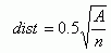
Although in reality each point pattern can be unique, all of them can be classified as random or not random.There are statistical tests for deciding if the difference between the empirical (actual) point pattern and the theoretical random pattern is statistically significant.Figure 1 shows the random pattern of schools in the province of Nova Scotia. In fact, this pattern is quite random - the difference between this pattern and the purely random pattern is not statistically significant.
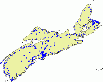
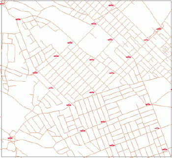
If a random pattern can be seen as a standard located in the middle of a continuum of all patterns, the actual pattern can approach this model from two sides.One extreme case is when all points are grouped together.A pattern of this type can be called clustered or agglomerated.Figure 2 presents such a clustered pattern of fast food restaurants in Halifax, Nova Scotia.
The economic process causing such a pattern is agglomeration. Agglomeration economies are well defined in literature and applied in practice.The opposite extreme is when all points are maximally dispersed.This type of pattern can be called regular (Figure 3).The economic processes causing such a pattern are based on competition.
As such, all patterns can belong to one of the following three types:
Agglomeration vs.competition
Point pattern analysis represents more then just a spatial analysis tool.It can provide vital information on processes that create patterns.Analyzing the process-pattern relationship can lead to very important conclusions.Astronomers, crystalographers, geologists, or archeologists analyze patterns to understand processes.In geography, classical location models explaining the distribution of economic activities in geographic space refer to patterns.For example, the classical central place model developed by Christaller for explaining the hierarchy of hexagonal markets is based on settlement patterns.
Two major economic forces shaping point patterns are agglomeration and competition.They can be seen as processes going in opposite directions: toward spreading or clustering.The driving forces behind different point patterns are competition costs and agglomeration benefits.The tradeoff between these opposite forces changes according to the activity in a given location.
Agglomeration (concentration, polarization) is the process of spatially grouping people and activities for some mutual advantage.The proximal location of points leads to the more efficient use of infrastructure. Agglomeration economies resulting from proximal location lead to clusters of such facilities as fast food restaurants, gas stations, car dealers or banks.Consumers also behave in a different way in the retail agglomeration environment demonstrating multipurpose shopping behavior.They are more likely to not purchase at all or to purchase large amounts if there are more competitors nearby.Although the agglomeration force brings all these facilities to one place, the individual facilities compete among themselves to get the best share of a market.
Competition forces traditionally are directed toward finding new market niches.Therefore towns in southern Germany described by Christaller's model were regularly distributed.If the distribution of a population is homogeneous, the competition process leads to a regular distribution of service facilities and centers.However, this fact changed radically in the 1950s when so-called mobile customers appeared as the result of the increasing number of car owners.Other processes, such as urbanization, resulted in the fact that land resources downtown became too costly for the economic viability of shopping centers and outlets. Today, regularly distributed service facilities do not represent as much of the market share competition as they once did.What has become important is the location of public service facilities including hospitals and schools.This is especially true when considering emergency services such as police or fire departments which cover large areas rapidly and often exhibit a regular pattern.
Quadrat analysis
Quadrat analysis is one of two most commonly used tools for analyzing the dispersion of points.The major steps of quadrat analysis are:
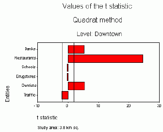
When the study area is smaller (3.8 km sq) and the number of points (restaurants, banks, schools, etc.) is also smaller, the range of values of t statistics becomes narrower.However, patterns remain similar.Restaurants are the most clustered, followed by banks and dentists.Other entities represent the random pattern (Figure 8).
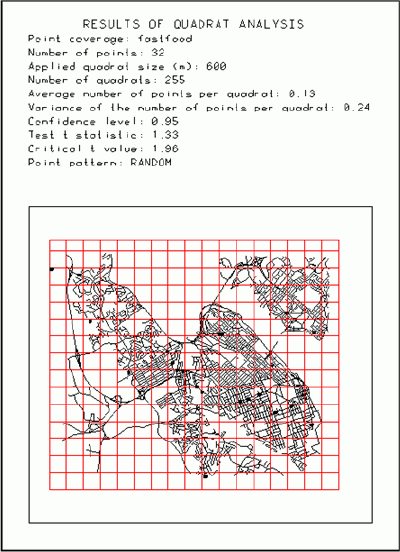
Changing the size of the study area can reveal different point patterns.However, a more critical issue is the selection of the optimal quadrat size (length of the square side).The example below (Figure 9) illustrates the problem.The study area is the city of Halifax with 32 points representing fast food restaurants.When the quadrat size is 600 m, the pattern is random.In literature, there is a formula for determining the optimal quadrat size.The optimal quadrat size (opt) is equal to the square root of the ratio doubled the size of the study area (A) and the number of points (n):

The optimal quadrat size was determined here to be
2,304 m.Applying
this value, the pattern for fast food restaurants is revealed as
clustered.
Nearest neighbor analysis
Nearest neighbor analysis represents another tool commonly used for studying the dispersion of points.This analysis consists of the following steps:
1.Calculate the distance from any point to all other points representing a pattern
2.Find the minimal distance for each point (nearest neighbor)
3.Calculate the mean minimal distance for the analyzed pattern
4.Calculate the mean distance for the random pattern (dist) as the half of the square root of the ratio between the size of study area (A) and the number of points (n):
5.Compare the observed empirical mean distance with
the expected
theoretical mean distance for the random pattern.
If the mean distances are similar, the analyzed pattern is random.If the analyzed mean distance is shorter than the mean distance for the random pattern, the pattern is clustered.Otherwise, the pattern is regular.In fact, for this purpose, the z statistic is used.If values of the z statistic are in the interval from -1.96 to +1.96, the pattern is random (at a confidence level of 95%).If the z value exceeds +1.96, the pattern is regular.If the z value is lower than -1.96, the pattern is clustered.
For example, for the entire province of Nova Scotia, the largest difference between the mean distance for the actual pattern and the mean distance for the random pattern can be observed for shopping centers (Figure 10 and 11).The distribution of shopping centers is the most clustered.Except hospitals and schools that are randomly distributed, other services represent a clustered pattern.It should be noted, however, that the distribution of the population of the province of Nova Scotia is also very irregular (concentrated in Halifax, along sea shores and major highways).The expected and actual distances can be plotted using a scatterplot graph (Figure 12).The diagonal imaginary line would then represent a random pattern (hospitals and schools).Objects below the diagonal line will have a clustered pattern.Object above can be described as having a regular pattern.
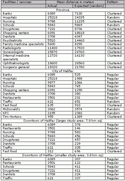
Table 1 lists all mean distances (actual and random) for various types of facilities or services for four study areas: the provincial level, the city of Halifax level, and two downtown levels (larger and smaller study areas).For example, shopping centers should be separated by 18.6 km for the random pattern, whereas in reality the mean distance between them is only 6.1 km and the pattern is clustered.The actual mean distance for the most common medical specialties in Nova Scotia is much shorter than expected one, as the majority of doctors work in the capital of the province.
The expected mean distance for banks is the same for the province (6,089 m) and Halifax (6,085 m), as both the study area and the number of points decrease proportionally.However, the actual distance for the province is 7,130 m, whereas for the city of Halifax it is only 525 m. As the result, the pattern of banks is clustered for Nova Scotia but is regular for the city of Halifax.The high concentration of population in Halifax causes most of facilities and services in Nova Scotia to be clustered.In Halifax, the same entities have a regular pattern.The pattern remains regular for two smaller study areas located in downtown Halifax.
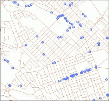
Figure 13 illustrates distances and patterns at the city of Halifax level.Only one entity shows a clustered pattern (the Tim Horton restaurant, selling mostly coffee and donuts), and three entities have a random pattern (traffic control points, KFC and McDonald's restaurants).Other entities represent clustered point patterns.
Higher order neighborhood
The same arrangements of points can represent different patterns if instead of the minimal distance from a given point to the nearest neighbor, the distance to the next neighbor is taken into consideration.The minimal distance to consecutive neighbors can be used.As the result, the higher order of neighborhood can be included into the analysis.
For example, Figure 2 shows the location of major fast food restaurants in Halifax.When the nearest neighbor analysis is applied, the mean distance is lower than expected and a clustered pattern is seen. However, for the 2nd and 3rd order of neighborhood, the calculated mean actual distance is similar to the expected one and the pattern is random.For higher orders (4th, 5th and 6th), the pattern is regular and the mean distance exceeds the expected distance.This experiment indicates that if every two neighboring fast food restaurants are merged, the competition rules will change dramatically.
Point pattern analysis deals with the simplest data sets and their properties (location of points).Indeed, its analytical tools are not extremely complicated.Only basic knowledge is necessary on how to use two parameters of the Poisson distribution (arithmetic mean and variance) and two statistical tests (t and z). However, results of this basic spatial analysis tool, mapped and interpreted can give the very valuable information.If processes generating point patterns are included into analysis, additional information for business analysts, city planners, and various levels of decision makers can be revealed.
Point data sets represent the most elementary and most common type of data.However, although they are elementary, their analysis can provide additional information for business analysts and city planners.This article describes techniques for doing so.
Although each point can be described by many attributes, a particularly important attribute is its location presented as x and y coordinates.In geometry and in GIS, a point is a dimensionless feature, having no length or area.Nevertheless, a point can be changed to a polygon when a larger scale map is used.For example, a point can be the centroid of a polygon representing real objects such as shopping centers, hospitals, schools, or restaurants.In business, the individual information about customers is often linked to points.Since point features may contain the most detailed and often confidential information, they can be aggregated for dissemination purposes by ZIP / postal code, census or administrative units.Sometimes point data sets have an abundance of attributes associated with each feature.These attributes can be studied with commonly used analytical methods such as statistics or data mining.However, in some cases, attributes are simply not available for point features.Even then, points can be analyzed using spatial analysis tools such as centrographic methods or point pattern analysis.
Theoretical background
If a point data set represents a sample of customers (for example, based on a customer questionnaire), one of the more important things that has to be studied is whether or not the sample is random.The random nature of a sample is a critical condition when making statistical inferences (testing statistical hypotheses) on an entire population.The random aspect of a sample can have a spatial context. For example, the sample should be randomly distributed in geographic space.Fortunately, there is a theoretical foundation for hypothetical models representing a purely random spatial distribution.This foundation is the Poisson statistical distribution.The entire point pattern analysis can be simply defined as the set of methods allowing for comparison of how similar a given pattern is to a purely random pattern.Point pattern analysis can be used for studying two properties: the arrangement and dispersion of points.There are two major tools for analyzing dispersion of points: the quadrat method and the nearest neighbor method.Both methods will be discussed shortly and illustrated with examples.
Three point patterns
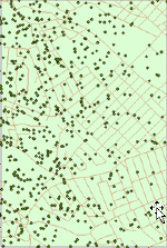
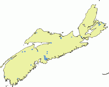
Although in reality each point pattern can be unique, all of them can be classified as random or not random.There are statistical tests for deciding if the difference between the empirical (actual) point pattern and the theoretical random pattern is statistically significant.Figure 1 shows the random pattern of schools in the province of Nova Scotia. In fact, this pattern is quite random - the difference between this pattern and the purely random pattern is not statistically significant.
 |
| Figure 1.Random pattern: distribution of schools in Nova Scotia. |
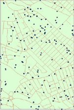
If a random pattern can be seen as a standard located in the middle of a continuum of all patterns, the actual pattern can approach this model from two sides.One extreme case is when all points are grouped together.A pattern of this type can be called clustered or agglomerated.Figure 2 presents such a clustered pattern of fast food restaurants in Halifax, Nova Scotia.
 |
| Figure2.Fast food restaurants in Halifax, Nova Scotia. |
The economic process causing such a pattern is agglomeration. Agglomeration economies are well defined in literature and applied in practice.The opposite extreme is when all points are maximally dispersed.This type of pattern can be called regular (Figure 3).The economic processes causing such a pattern are based on competition.
 |
| Figure 3.Regular point pattern: schools in Halifax, Nova Scotia. |
As such, all patterns can belong to one of the following three types:
- Random
- Clustered
- Regular
 |
 |
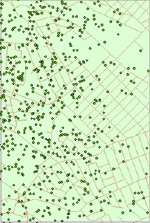 |
Figure 4.
Distribution of hypothetical customers; from the left:
random, regular, clustered.
Agglomeration vs.competition
Point pattern analysis represents more then just a spatial analysis tool.It can provide vital information on processes that create patterns.Analyzing the process-pattern relationship can lead to very important conclusions.Astronomers, crystalographers, geologists, or archeologists analyze patterns to understand processes.In geography, classical location models explaining the distribution of economic activities in geographic space refer to patterns.For example, the classical central place model developed by Christaller for explaining the hierarchy of hexagonal markets is based on settlement patterns.
Two major economic forces shaping point patterns are agglomeration and competition.They can be seen as processes going in opposite directions: toward spreading or clustering.The driving forces behind different point patterns are competition costs and agglomeration benefits.The tradeoff between these opposite forces changes according to the activity in a given location.
Agglomeration (concentration, polarization) is the process of spatially grouping people and activities for some mutual advantage.The proximal location of points leads to the more efficient use of infrastructure. Agglomeration economies resulting from proximal location lead to clusters of such facilities as fast food restaurants, gas stations, car dealers or banks.Consumers also behave in a different way in the retail agglomeration environment demonstrating multipurpose shopping behavior.They are more likely to not purchase at all or to purchase large amounts if there are more competitors nearby.Although the agglomeration force brings all these facilities to one place, the individual facilities compete among themselves to get the best share of a market.
Competition forces traditionally are directed toward finding new market niches.Therefore towns in southern Germany described by Christaller's model were regularly distributed.If the distribution of a population is homogeneous, the competition process leads to a regular distribution of service facilities and centers.However, this fact changed radically in the 1950s when so-called mobile customers appeared as the result of the increasing number of car owners.Other processes, such as urbanization, resulted in the fact that land resources downtown became too costly for the economic viability of shopping centers and outlets. Today, regularly distributed service facilities do not represent as much of the market share competition as they once did.What has become important is the location of public service facilities including hospitals and schools.This is especially true when considering emergency services such as police or fire departments which cover large areas rapidly and often exhibit a regular pattern.
Quadrat analysis
Quadrat analysis is one of two most commonly used tools for analyzing the dispersion of points.The major steps of quadrat analysis are:
- Overlay a set of points with a grid of squares (each square is called a quadrat)
- Count the number of points per quadrat
- Calculate the frequency of counts
- Compare the obtained empirical frequency with the theoretical frequency for the random pattern obtained from the Poisson distribution.
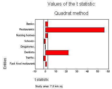 |
| Figure 5.Values of the t statistic for the larger study area (downtown Halifax, two vertical lines represent the interval of t values for the random pattern). |
 |
| Figure 6.Regular pattern of traffic control points downtown Halifax. |
 |
| Figure 7.Clustered distribution of restaurants downtown Halifax. |
When the study area is smaller (3.8 km sq) and the number of points (restaurants, banks, schools, etc.) is also smaller, the range of values of t statistics becomes narrower.However, patterns remain similar.Restaurants are the most clustered, followed by banks and dentists.Other entities represent the random pattern (Figure 8).
 |
| Figure 8.Values
of the t statistic for the smaller study area (downtown
Halifax; two vertical lines represent the interval of the t values
for
the random pattern). |
Changing the size of the study area can reveal different point patterns.However, a more critical issue is the selection of the optimal quadrat size (length of the square side).The example below (Figure 9) illustrates the problem.The study area is the city of Halifax with 32 points representing fast food restaurants.When the quadrat size is 600 m, the pattern is random.In literature, there is a formula for determining the optimal quadrat size.The optimal quadrat size (opt) is equal to the square root of the ratio doubled the size of the study area (A) and the number of points (n):
 |
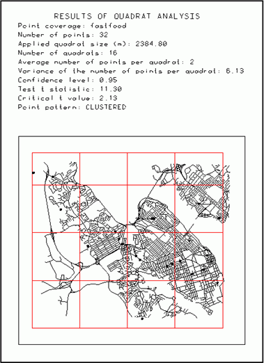 |
Figure 9.Quadrat size vs.point
pattern.Click images for larger view.
Nearest neighbor analysis
Nearest neighbor analysis represents another tool commonly used for studying the dispersion of points.This analysis consists of the following steps:
1.Calculate the distance from any point to all other points representing a pattern
2.Find the minimal distance for each point (nearest neighbor)
3.Calculate the mean minimal distance for the analyzed pattern
4.Calculate the mean distance for the random pattern (dist) as the half of the square root of the ratio between the size of study area (A) and the number of points (n):
If the mean distances are similar, the analyzed pattern is random.If the analyzed mean distance is shorter than the mean distance for the random pattern, the pattern is clustered.Otherwise, the pattern is regular.In fact, for this purpose, the z statistic is used.If values of the z statistic are in the interval from -1.96 to +1.96, the pattern is random (at a confidence level of 95%).If the z value exceeds +1.96, the pattern is regular.If the z value is lower than -1.96, the pattern is clustered.
For example, for the entire province of Nova Scotia, the largest difference between the mean distance for the actual pattern and the mean distance for the random pattern can be observed for shopping centers (Figure 10 and 11).The distribution of shopping centers is the most clustered.Except hospitals and schools that are randomly distributed, other services represent a clustered pattern.It should be noted, however, that the distribution of the population of the province of Nova Scotia is also very irregular (concentrated in Halifax, along sea shores and major highways).The expected and actual distances can be plotted using a scatterplot graph (Figure 12).The diagonal imaginary line would then represent a random pattern (hospitals and schools).Objects below the diagonal line will have a clustered pattern.Object above can be described as having a regular pattern.
 |
| Figure 10.Comparison of mean observed distance with mean expected (random) distance at the provincial level. |
 |
| Figure 11.Clustered pattern of shopping centers in Nova Scotia. |
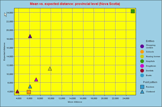 |
| Figure 12.Distances vs. patterns for the provincial level.Click image for larger view. |
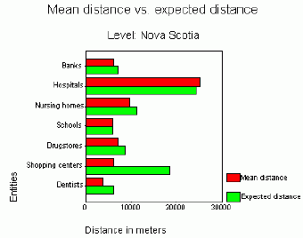
Table 1 lists all mean distances (actual and random) for various types of facilities or services for four study areas: the provincial level, the city of Halifax level, and two downtown levels (larger and smaller study areas).For example, shopping centers should be separated by 18.6 km for the random pattern, whereas in reality the mean distance between them is only 6.1 km and the pattern is clustered.The actual mean distance for the most common medical specialties in Nova Scotia is much shorter than expected one, as the majority of doctors work in the capital of the province.
The expected mean distance for banks is the same for the province (6,089 m) and Halifax (6,085 m), as both the study area and the number of points decrease proportionally.However, the actual distance for the province is 7,130 m, whereas for the city of Halifax it is only 525 m. As the result, the pattern of banks is clustered for Nova Scotia but is regular for the city of Halifax.The high concentration of population in Halifax causes most of facilities and services in Nova Scotia to be clustered.In Halifax, the same entities have a regular pattern.The pattern remains regular for two smaller study areas located in downtown Halifax.
 |
| Table 1.Mean distances for various facilities / services and study areas.Click image for larger view. |
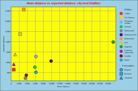
Figure 13 illustrates distances and patterns at the city of Halifax level.Only one entity shows a clustered pattern (the Tim Horton restaurant, selling mostly coffee and donuts), and three entities have a random pattern (traffic control points, KFC and McDonald's restaurants).Other entities represent clustered point patterns.
 |
| Figure 13.Distances vs. patterns for the city of Halifax level. Click image for larger view. |
Higher order neighborhood
The same arrangements of points can represent different patterns if instead of the minimal distance from a given point to the nearest neighbor, the distance to the next neighbor is taken into consideration.The minimal distance to consecutive neighbors can be used.As the result, the higher order of neighborhood can be included into the analysis.
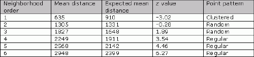
For example, Figure 2 shows the location of major fast food restaurants in Halifax.When the nearest neighbor analysis is applied, the mean distance is lower than expected and a clustered pattern is seen. However, for the 2nd and 3rd order of neighborhood, the calculated mean actual distance is similar to the expected one and the pattern is random.For higher orders (4th, 5th and 6th), the pattern is regular and the mean distance exceeds the expected distance.This experiment indicates that if every two neighboring fast food restaurants are merged, the competition rules will change dramatically.
 |
| Table 2.Higher order of neighborhood vs.point pattern for major fast food restaurants.Click image for larger view. |
Point pattern analysis deals with the simplest data sets and their properties (location of points).Indeed, its analytical tools are not extremely complicated.Only basic knowledge is necessary on how to use two parameters of the Poisson distribution (arithmetic mean and variance) and two statistical tests (t and z). However, results of this basic spatial analysis tool, mapped and interpreted can give the very valuable information.If processes generating point patterns are included into analysis, additional information for business analysts, city planners, and various levels of decision makers can be revealed.
From Our Homepage
Saying Farewell to an Amazing Journey
Communicating with Maps
Is There a GIS Career Ladder?
What does it mean to be geospatially smart? Series
Ways Real Estate and Property Developers Utilize Melissa GeoData for Data-Driven Decisions
Unlocking Value From Daily Satellite Imagery and Insights
Maximizing the Value of Your Address Data with Geo Addressing
How Indoor Mapping Enhances the Security of Smart Buildings
Look Ahead: AI, Location Intelligence and Efficiency
Collaboration Takes on Sea Level Rise & Dynamic Technology Environments
Brownies for Brownfields
Has Everything Been Mapped Already?
How Is Data Literacy Changing in an Artificial Intelligence Landscape
Portfolios for GIS Professionals: More Than Just Maps
How to Create a Distance Matrix in QGIS - A Step-by-Step Guide
7 Ideas for Bringing GIS into the K-12 Classroom
The Geography of Movement