
Geospatial Data Visualization Tools And Mapping Methods That Actually Work


A map can turn a flat table of coordinates into something you can read in seconds, and that is the real value of geospatial data visualization tools. They help you convert geographic data and information into a visual form that shows location, density, movement, or terrain without forcing people to dig through raw data. Used well, they make spatial analysis faster and decision-making more grounded.
Geovisualization in Plain Terms
Geovisualization is the practice of showing location-based data through a map, chart, or interactive display so patterns become visible. Instead of staring at rows in a database, you see how a point, a boundary, or a route behaves across space. That can include latitude and longitude pairs, a polygon boundary, a DEM surface, or time-stamped GPS tracks.
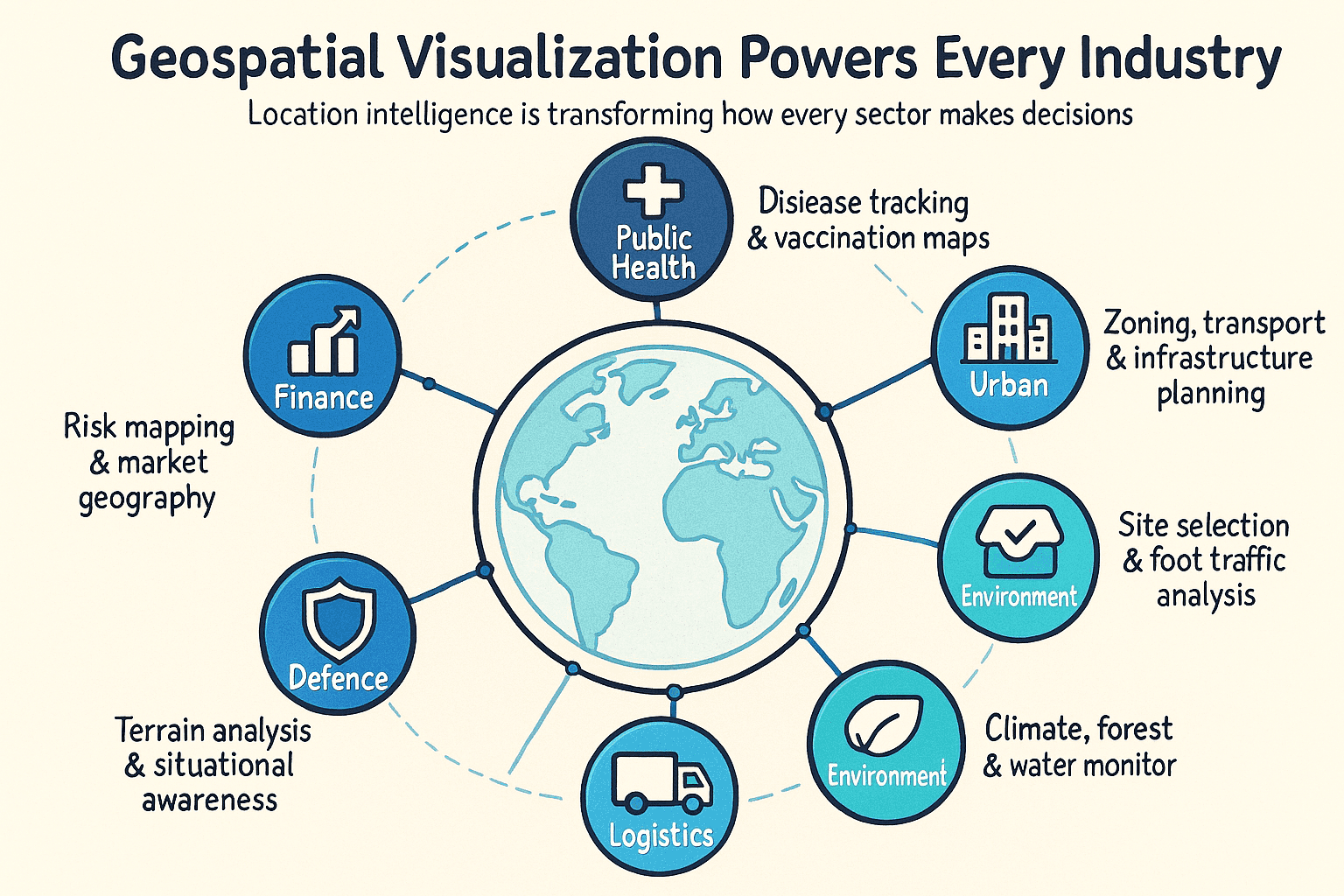
The method matters because geographic information system work shows up in more places than many teams expect. Retail teams use it to study store placement. Public agencies use it to follow spread patterns or service coverage. I have seen the same underlying data set look vague in a spreadsheet and obvious once it is placed on a map.
Modern software has made the barrier much lower than it used to be. A decade ago, serious cartography usually meant sitting inside dedicated GIS software for hours. Some of the common tools mentioned here include ArcGIS and QGIS for general GIS work, plus and Tableau Software for faster visual exploration. On the web side, Leaflet and are practical choices when the display needs interaction.
The hard part is usually matching the geometry to the question. A store is a point. A road is a line. A county is a polygon. Temperature behaves more like a surface. Moving vehicles produce trajectories. If that alignment is off, the visualization may still look polished, but the data analysis will drift off course like bad GPS fixes in a weak signal area.
At its best, geospatial visualization closes the gap between raw information and practical action. That is why it remains so useful in planning, operations, and environmental monitoring.
Features and Benefits of Mapping Geographic Data
Key Capabilities in Modern Platforms
- Layered interaction- Good mapping tools let you stack business locations over roads or demography so relationships show up quickly.
- Live feeds- Some systems can ingest GPS streams or sensor updates and refresh the view in near real time.
- Support for different map styles- The stronger platforms can visualize points and polygons without much friction.
- Built-in spatial analysis- Filters, clustering, and proximity checks are often available directly inside the interface.
- Control over symbol and color- Styling affects readability more than many teams assume, especially when audiences are mixed.
- Easy sharing- Export to web views or PDFs is common, and API options are increasingly standard.
Why Teams Spend Time on This
- Faster judgment calls- A pattern that takes 20 minutes to find in a table may stand out after one glance on a map.
- Better use of resources- Demand gaps, weak coverage, or overloaded zones become easier to spot.
- Shared understanding- Operations staff and leadership can usually interpret a strong map without deep GIS training.
- Hidden spatial trends become visible- Clusters, gaps, and corridors are often invisible until location is added.
- Competitive advantage- Firms using location intelligence usually understand market geography sooner than peers.
- Broader access to information- A visual layer lowers the skill threshold for people who would never work directly from a database.
How to Pick the Right Map
Before choosing a visualization, I usually check three things. First, identify the geometry. If the data is made of points, a point map may be enough. If the analysis depends on regions, you probably need polygons and a choropleth map or something related.
Second, define the exact question. If you need to show where assets sit, point mapping works well. If you need to compare rates by region, use a choropleth map or a proportional symbol map. If the real issue is movement, a flow map or spider map is usually more honest.
Third, think about the audience. General readers understand point maps and region shading quickly. Heat map views and cartograms usually need a bit more explanation. Topographic output tends to be most useful to people already familiar with terrain and raster graphics.
The decision matrix later in this article pulls all 12 options into one place.
12 Ways to Visualize Geospatial Data on a Map
Accurate source data matters, but representation matters too. The same data set can push you toward very different conclusions depending on the visualization you choose.
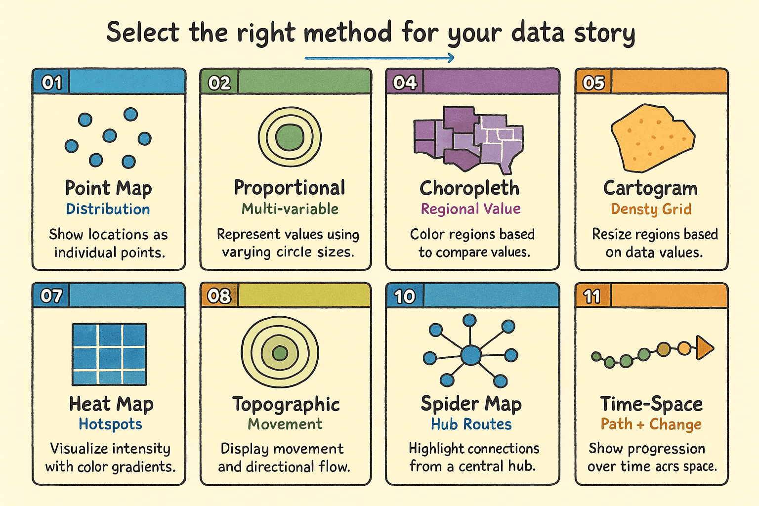
12 geospatial map types - a quick visual reference for matching a map style to the question in front of you.
Below is a practical walkthrough of the 12 common approaches, including where each one fits and where it starts to break down.
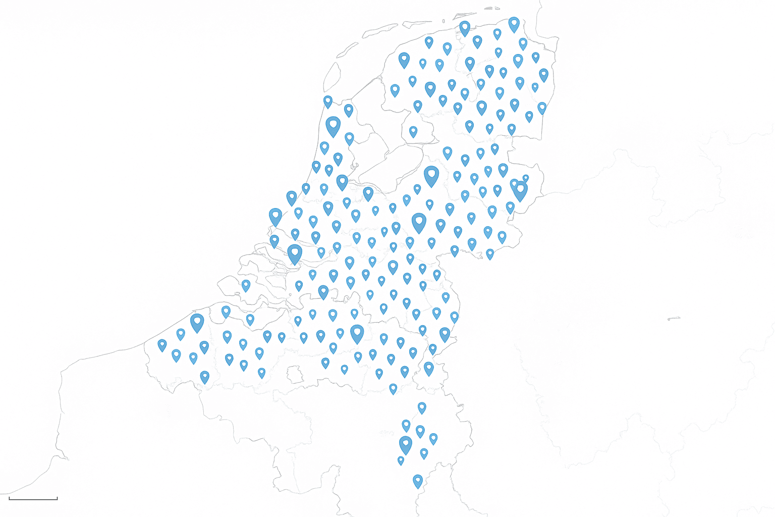
1. Point Map
Best for - exact location records such as stores, incidents, or sensors.
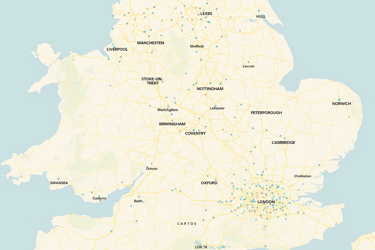
A point map is the cleanest starting point for discrete features. Every record with latitude and longitude becomes a visible symbol at its geographic coordinate system position. Hospitals, venues, and customer locations are classic examples.
At close zoom levels, this map shows exact placement. Pulled back, it starts to reveal clusters or sparse coverage. It works best when geocoding is reliable and the record count is manageable. Once volume rises, overplotting can make the result muddy.
- Strengths- preserves exact location and is fast to build.
- Limitations- dense data can become unreadable, and all points can look equally important.
2. Proportional Symbol Map
Best for - comparing magnitude at known locations.
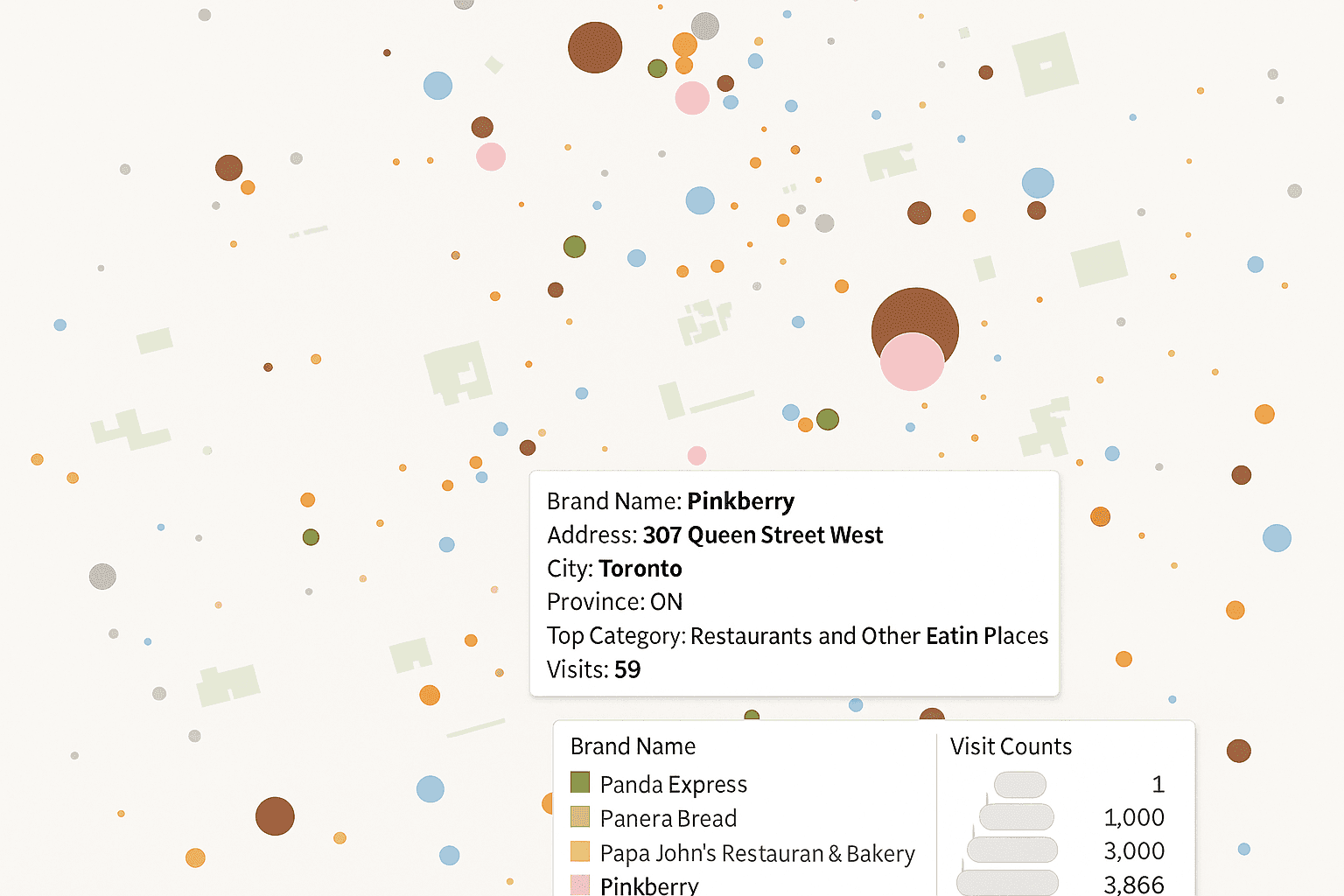
This approach extends a point map by scaling each symbol to a numeric value. A larger circle might represent higher sales, larger population, or stronger demand. Color can sometimes encode a second variable if the design stays restrained.
It is a useful middle ground because you keep location accuracy while adding magnitude. The tradeoff is human perception. People tend to misread area, especially with outliers. A few very large values can make smaller ones nearly disappear.
- Strengths- combines place and amount in one view.
- Limitations- overlap is common in dense areas, and visual scaling needs care.
3. Cluster Map
Best for - very large point collections where direct plotting would pile up.
A cluster map groups nearby points into aggregate markers until the user zooms in. As the scale changes, those groups split and eventually expose individual records. This keeps the screen usable and helps browser performance.
I have found this especially helpful once a point layer moves into tens of thousands of records. It behaves a bit like filtering noisy GPS traces before interpretation. The raw data stays intact, but the display becomes readable.
- Strengths- handles heavy point volumes and supports smooth interaction.
- Limitations- cluster edges are arbitrary, and static print output usually suffers.
4. Choropleth Map
Best for - comparing normalized values across regions.
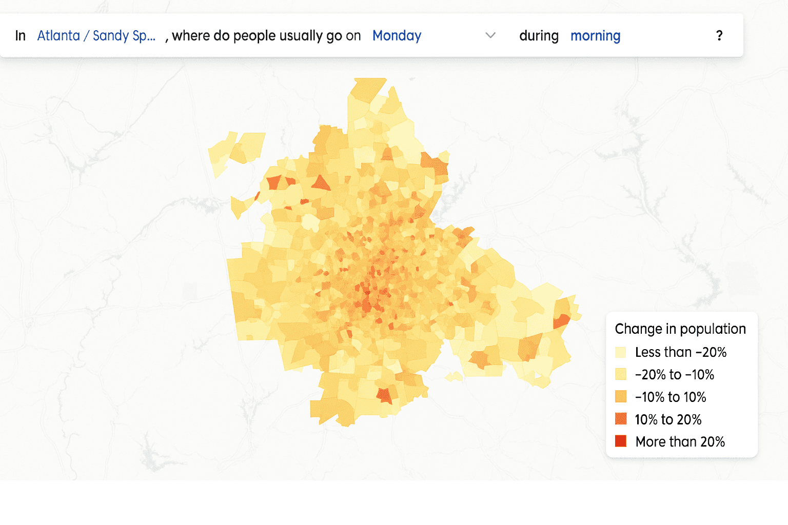
A choropleth map shades polygons such as states or ZIP codes according to a value. This is one of the most familiar forms of thematic cartography, and most audiences read it quickly. To build it, you need a region boundary file and an attribute table with a reliable join key.
Normalization is the rule here. Raw counts often mislead because large or populous regions dominate attention. Rates such as cases per 100,000 residents or sales per area unit usually tell the truer story. If small regions matter, inset treatment may be necessary so they do not disappear visually.
- Strengths- familiar, quick to build, and effective for rates or percentages.
- Limitations- large polygons dominate, and poor normalization distorts interpretation.
5. Cartogram Map
Best for - reducing the visual bias of geographic area.
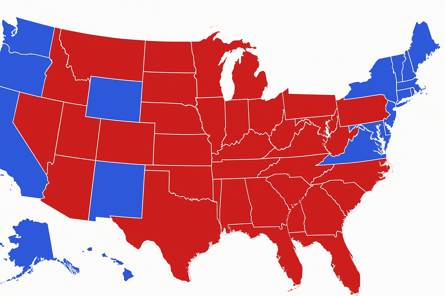
A cartogram resizes geographic units according to a chosen variable rather than actual land area. Population, election totals, or disease burden are common inputs. The point is to stop large but low-value areas from grabbing all the visual weight.
Some cartograms preserve shared borders. Others replace regions with circles or tiles. They can be excellent for fairness in comparison, though they demand more explanation because the familiar shape of the map changes. In practice, many readers benefit from seeing a standard reference map beside it.
- Strengths- reduces area bias and makes smaller important regions easier to see.
- Limitations- geography becomes harder to recognize, and generation is more complex.
6. Hexagonal Binning Map
Best for - large point density views without tying results to administrative boundaries.
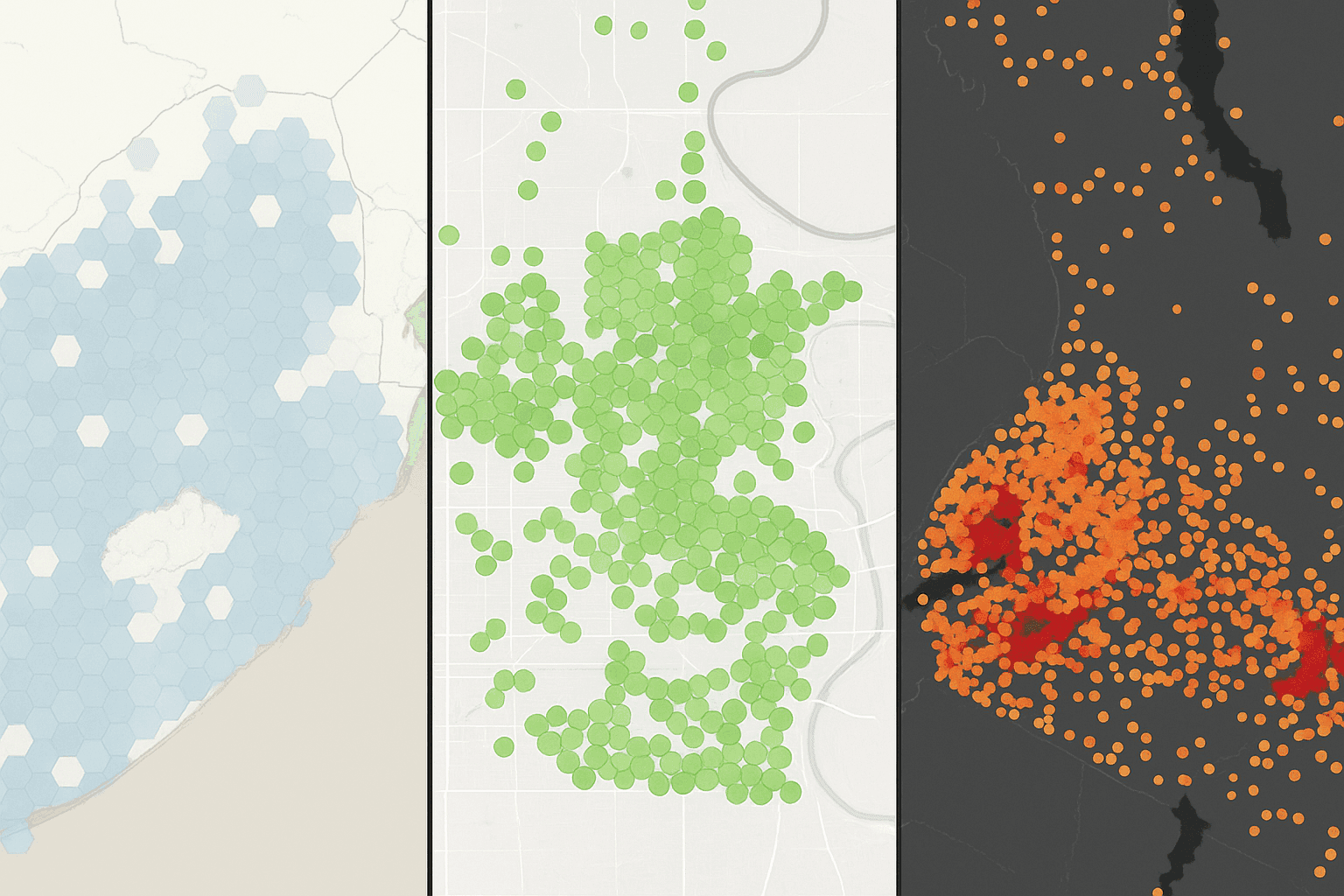
This style overlays the map with equal hexagons and aggregates the points inside each cell. Each hexagon gets a color based on count, density, or another statistic. The result feels smoother than raw points and less politically biased than region-based polygons.
Hexagons are favored because neighbor relationships are visually consistent, which improves usability. The real design lever is bin size. Larger cells simplify the picture, while smaller ones hold local detail. A mismatch between cell size and map extent can make the whole view feel off.
- Strengths- works well with huge point volumes and avoids dependence on region borders.
- Limitations- bin size is subjective, and edge cells can distort the pattern.
7. Heat Map
Best for - smooth density gradients across space.
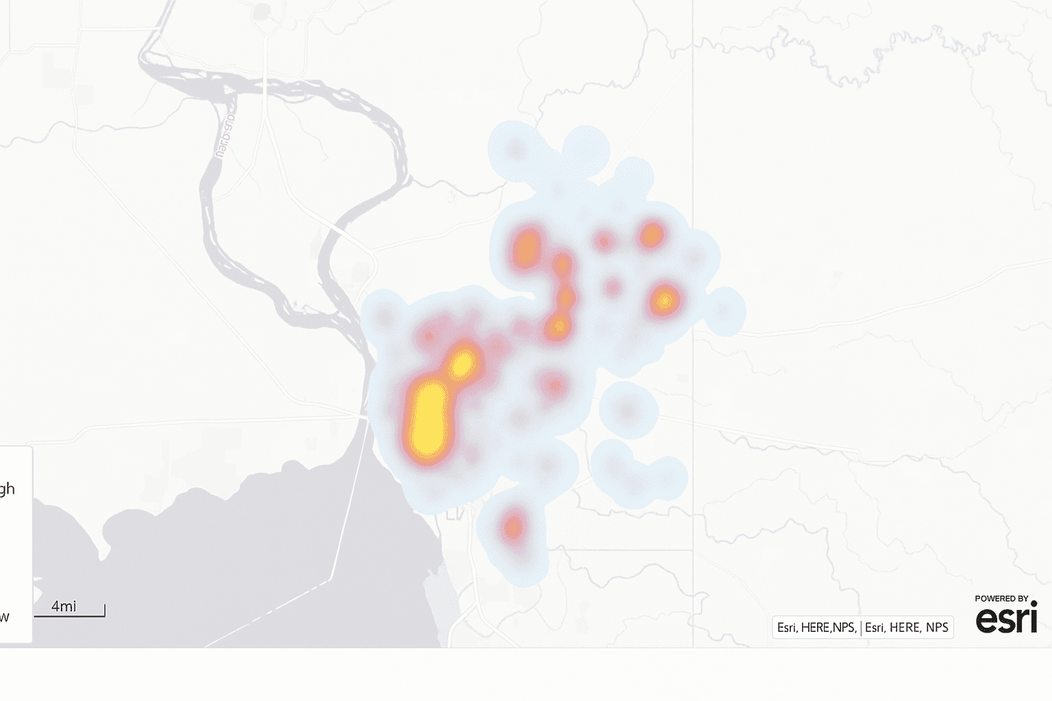
A heat map converts point observations into a continuous surface, usually through kernel density estimation. Warmer color values show stronger concentration, while cooler zones indicate lower intensity. This can be very effective when exact counts matter less than broad hotspot detection.
Compared with a choropleth map, a heat map ignores fixed boundaries. That is the key difference. If your question is tied to county lines, use polygons. If your question is where activity clusters regardless of those lines, a heat map is usually the better fit.
- Strengths- intuitive for general readers and good at revealing hotspots.
- Limitations- exact values are hard to recover, and smoothing can mislead.
8. Topographic Map
Best for - elevation, slope, and physical landscape analysis.
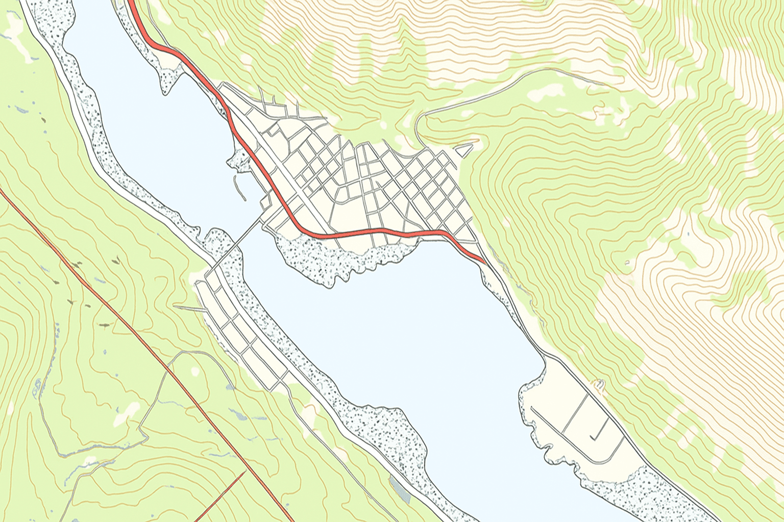
A topographic map represents terrain with contour lines and often shaded relief. Rivers, roads, or other features may be added for context, but the core job is showing landform structure. It remains standard in engineering, planning, and navigation.
Most modern topographic output starts from DEM data, frequently stored as raster graphics. From there, GIS software can derive contours or slope surfaces. Satellite imagery and even unmanned aerial vehicle capture can enrich this workflow when you need current surface detail.
- Strengths- represents elevation well and relies on well-known mapping conventions.
- Limitations- requires DEM processing, and dense contours do not scale down gracefully.
9. Flow Map
Best for - movement between origins and destinations.
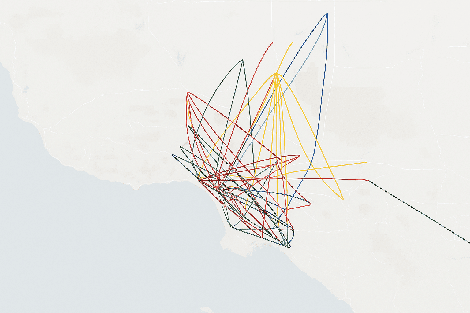
A flow map shows movement across space using directional lines between paired locations. Line width often stands in for volume, which makes migration, logistics, or trade patterns much easier to read than a plain matrix table. The underlying data usually arrives as an OD file with both endpoints and a numeric measure.
The challenge is clutter. Once too many lines overlap, the map turns into a tangle. In my own testing, trimming to the strongest flows usually improves interpretation far more than adding more styling ever does.
- Strengths- direct way to visualize movement and relative volume.
- Limitations- line overlap quickly hurts readability, and OD prep takes time.
10. Spider Map
Best for - hub-and-spoke relationships.
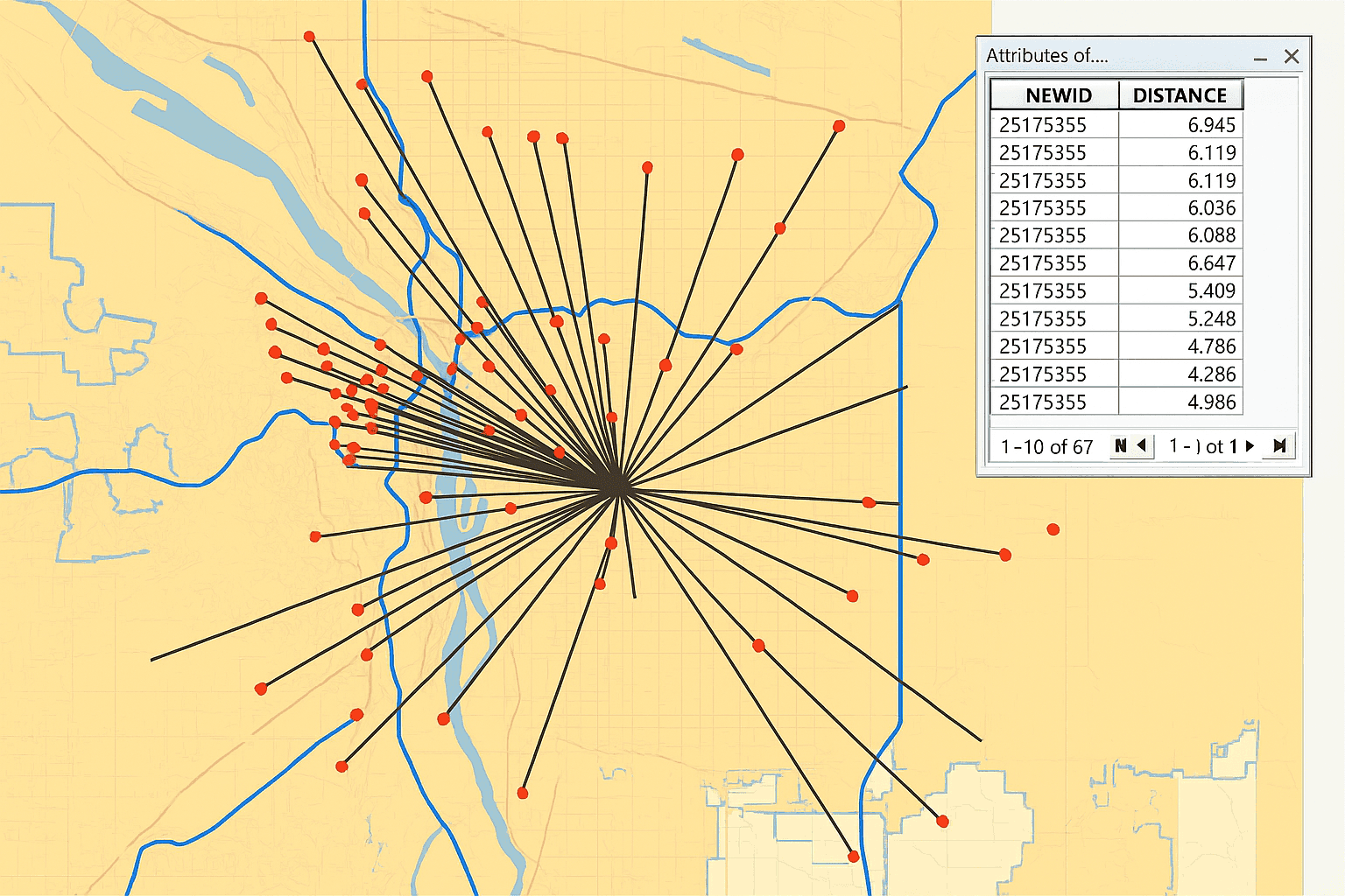
A spider map connects many origins to one hub, or the reverse, using straight or gently curved lines. It emphasizes reach and connectivity more than exact travel volume. That makes it useful for service areas, store catchments, and transit hubs.
It is simpler than a full flow map because the network structure is clearer. Still, high connection counts can create a hairball effect. Filtering or grouping usually helps if the map starts to collapse into visual noise.
- Strengths- strong for service reach analysis and easy to grasp.
- Limitations- dense hubs become messy, and route realism is limited.
11. Time-Space Distribution Map
Best for - moving objects tracked across space and time.
This form combines movement with time, usually from timestamped GPS records. Each observation contains an identifier, a time value, and coordinates. Ordered together, those points reveal a trajectory that can be animated or color-coded by time.
These maps are useful for fleet tracking, wildlife studies, and transport planning. The catch is data volume. Even a short collection window can produce a very large data set, so filtering and time-window controls are often necessary to keep performance acceptable.
- Strengths- shows route behavior and dwell patterns directly.
- Limitations- requires time-aware trajectory data, and animation must be handled carefully.
12. Data Space Distribution Map
Best for - showing how attributes change along a moving path.
This is a more advanced extension of the time-space view. It tracks movement, then overlays another attribute such as passenger count or speed along the route. The result lets you see where motion changes and where the associated variable rises or falls.
A transit example makes this easy to picture. Instead of showing only the rail line, the map can show how passenger load changes from stop to stop. That level of detail is powerful for operational review, though it usually requires custom software work because few off-the-shelf tools handle it cleanly.
- Strengths- combines route behavior with attribute change in one display.
- Limitations- the data requirements are heavy, and visual clutter is a real risk.
Decision Matrix
Use this quick reference to connect the question, the required data format, and the likely toolset. Here, complexity refers to implementation effort.
| Map Type | Best For | Required Data Format | Recommended Tools | Complexity |
|---|---|---|---|---|
| Point map | Exact location distribution | CSV with latitude and longitude | Leaflet or | Low |
| Proportional symbol | Location plus magnitude | CSV with coordinates and a numeric field | Plotly or QGIS | Low |
| Cluster map | Large point sets | GeoJSON points | Mapbox GL JS or | Low |
| Choropleth | Normalized regional values | GeoJSON polygons plus joined CSV | Plotly or Tableau Software | Low |
| Cartogram | Reduce geographic size bias | GeoJSON polygons plus CSV | or a QGIS plugin | High |
| Hexagonal binning | Density without admin boundaries | CSV with coordinates | or | Medium |
| Heat map | Smooth density surface | CSV with coordinates and optional weight | or Mapbox GL JS | Low |
| Topographic | Terrain and elevation | GeoTIFF DEM raster | QGIS or ArcGIS | Medium |
| Flow map | OD movement | OD matrix CSV | ArcLayer or | Medium |
| Spider map | Hub-and-spoke connections | CSV with origin and hub coordinates | ArcGIS Business Analyst or | Medium |
| Time-space | Trajectories over time | Timestamped GPS CSV | Trip or Trips | High |
| Data space | Attribute change along a route | Route stops plus attribute CSV | Custom or custom | High |
Choosing the Best Fit for Your Data
Across these 12 methods, the span runs from simple location questions to much richer movement analysis. The right map is usually the one that answers the question with the least mental work for the reader. Fancy rendering is no substitute for fit.
Start with the question, then confirm the geometry and the data format. A well-made choropleth in Plotly can be more useful than a bespoke interactive build that takes weeks and still leaves the audience guessing. I generally prefer the simpler route unless the analysis truly needs more.
Tool choice follows from that logic. ArcGIS and QGIS are strong general GIS environments. is excellent for browser-based mapping with CSV uploads. Leaflet and Mapbox GL JS work well for web layers such as point maps and heat map output. is better for heavier interaction, while Tableau Software and Looker fit business dashboards. remains a good option when custom visualization graphics are required, and GDAL with ogr2ogr is still the practical backbone for format conversion.
Common Tools Mentioned in This Article
- ArcGIS and QGIS - general GIS environments for editing, analysis, and map production.
- and Leaflet - useful for browser-based mapping and interactive web layers.
- and - better suited to heavier interaction or custom visualization work.
- Tableau Software and Looker - business dashboard tools that can support map-based reporting.
- Mapbox GL JS and - focused web mapping tools for dynamic layers and density views.
- GDAL and ogr2ogr - practical utilities for geospatial data conversion.
Among the tools listed on this page, the open source options are QGIS, , Leaflet, , , GDAL, and ogr2ogr. That matters if you need stronger control over deployment or want to inspect how the software handles your geographic data and information.
Data format also shapes the outcome. Point-based work often starts from a simple CSV with latitude and longitude. Polygon-based mapping usually needs GeoJSON or a shapefile plus a join key. GeoJSON is especially useful for web mapping, while shapefiles still show up often in desktop GIS. A proper CRS or EPSG definition matters too, since a bad projection setup can shift features enough to break analysis.
If your input is regional, normalize before building a choropleth map unless the real question is about totals. If you want to compare absolute size by location, a proportional symbol map is often more honest. And if you need to inspect broad clustering without boundaries, a heat map usually beats forced region aggregation.
Google Earth still has value for quick visual inspection, especially alongside satellite imagery, but it is better treated as a viewing environment than a full analytical stack. For production geovisualization, dedicated GIS or mapping software usually offers stronger control over data, symbol logic, and usability.
FAQ
What Data Format Fits Most Map Types
Point-heavy methods such as point maps, cluster maps, and heat map layers usually work from CSV files with latitude and longitude. Polygon methods such as a choropleth map need GeoJSON or shapefiles plus an attribute table and a shared key. Flow and spider maps require origin and destination coordinates. If you are working in a browser stack, GeoJSON support is usually the easiest path.
Which Free Tools Are Worth Using
Several solid options are available at no cost. QGIS covers a wide range of GIS tasks and supports many data formats. is a fast no-code option for uploading a CSV and testing point, density, or trip layers. Plotly and are useful if you work in Python or JavaScript and want more control.
Heat Map vs Choropleth Map
A choropleth map colors predefined regions such as counties or ZIP codes. A heat map ignores those boundaries and creates a continuous density surface from point data. Use the first when the boundary itself matters. Use the second when you want to see where activity concentrates in open space.
When to Normalize a Choropleth
In most cases, normalize before mapping. Raw totals usually reward larger regions and can hide the actual rate pattern. Cases per resident or incidents per household usually provide a fairer comparison. If the insight truly is about absolute totals, a proportional symbol map is often the better option.
Do You Always Need GeoJSON
No. For simple point mapping, a plain CSV is often enough. GeoJSON becomes important when you need polygons or more complex geometry. Desktop GIS tools also work well with shapefiles, and conversion between formats is routine with GDAL utilities.
Done well, geospatial visualization gives geographic data and information the structure they need to become useful. That may be a single point layer or a custom movement model. Either way, the map should answer the question faster than the raw table ever could.


